Project Description
Create gourmet dishes with affordability and learning in mind. Features and functions include browsing, ingredient list planning, lessons, step-by-step instructions, sharing, and folders when organizing and bookmarking recipes.
Feedback Summary
Link to Usability Research Report for Well Savouré
The usability test showed an overall positive completion rate, with all participants completing at least 4 out of the 5 tasks. One of the tasks, which required generating a grocery list for a specific recipe, however, resulted in struggle and confusion for 2 out of the 3 participants. They were able to locate the feature, but weren’t able to generate the list. Another task required participants to locate and create a folder to store saved recipes, which they all successfully completed; however, 2 out of 3 participants struggled in locating that section at first, as it was in the profile section. Overall, participants found the majority of the navigation easy to use and understand while noting small hurdles they’ve encountered or became hesitant about. These results and the feedback given shine a light on certain sections of the app, updating and making the generating list and folder feature should be revised and improved, as it would allow easier access and help reduce confusion for a smoother experience.
Design Updates
Two usability concerns:
- Making the grocery list generator a smoother experience and easier to locate.
- Changing the profile section into a folder section.
Two accessibility concerns:
Throughout the app, a lot of the elements have met accessibility standards such as legible text size, legible typefaces, placement of labels for inputs, consistent layout, and sufficient spacing. Nevertheless, there are a few areas that need to be reviewed and updated.
- Buttons & Tap Targets – Increase Button Size and High Contrast Colors.
- Images and icons – Adding alt text descriptions, avoiding text inside images, and using recognizable icons.
Usability Issue 1 – Make the grocery list generator a smoother experience and easier to locate.
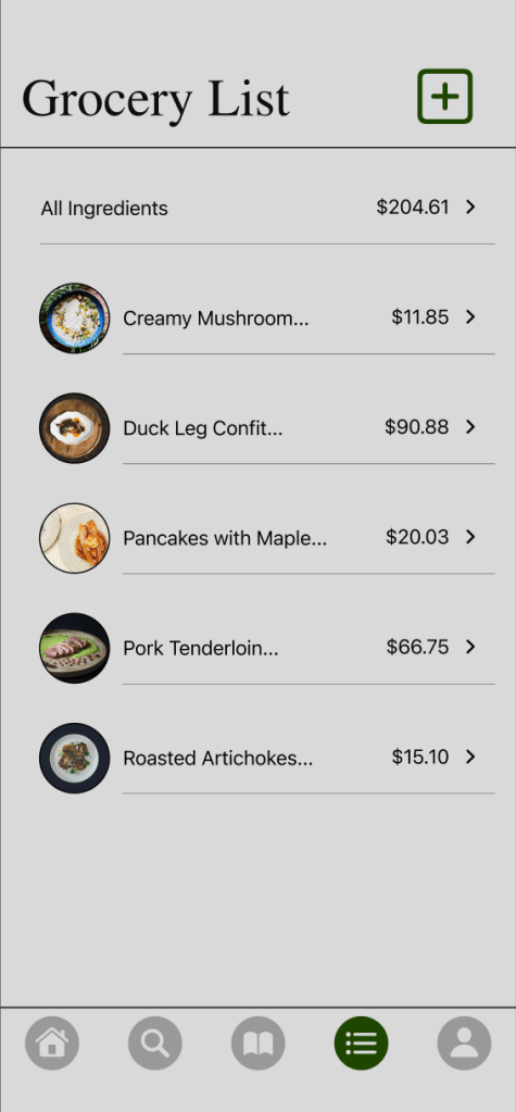
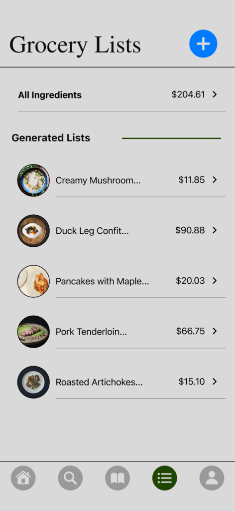
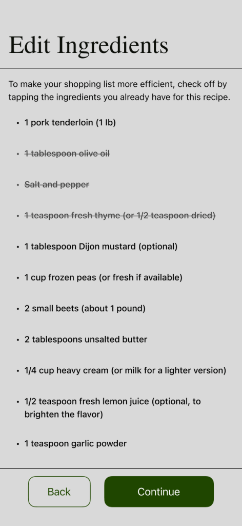
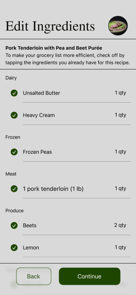
About 2 of 3 participants didn’t complete the first task as intended. Locating the list section was easy, however, when generating the list, it became a confusing process. First, the add icon is now filled in and blue to be seen better, and the layout has been sectioned to better categorize the existing lists.
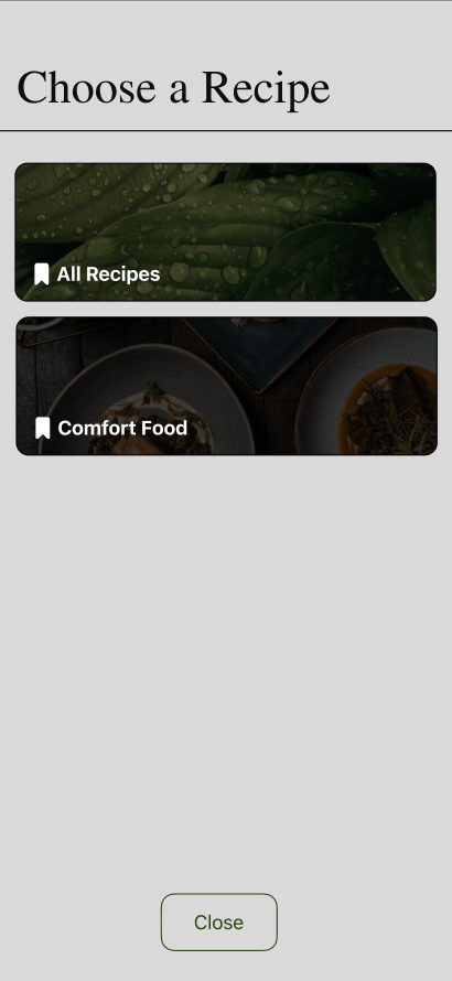
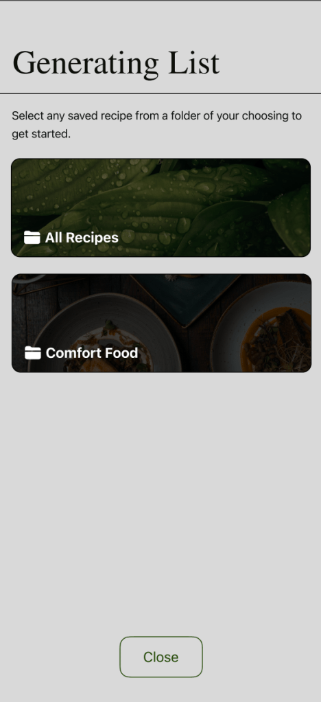
Next, when choosing a recipe to generate a list from, the process wasn’t as clear. The title of this section was modified, as well as adding a short explanation on what to do next for clarity.

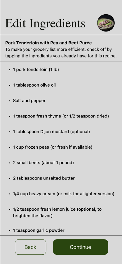
When selecting the recipe to generate in the list feature, the flow is disrupted as the users were redirected to the recipe’s overview with no clear direction when continuing with the list, as they were meant to tap on begin and generate once more. This was then reduced by eliminating the overview and generate option for this specfic process. Now they can immediately head to editing the ingredients list while providing an image and the name of the dish to recall.
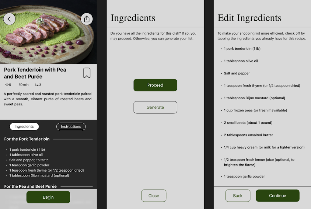
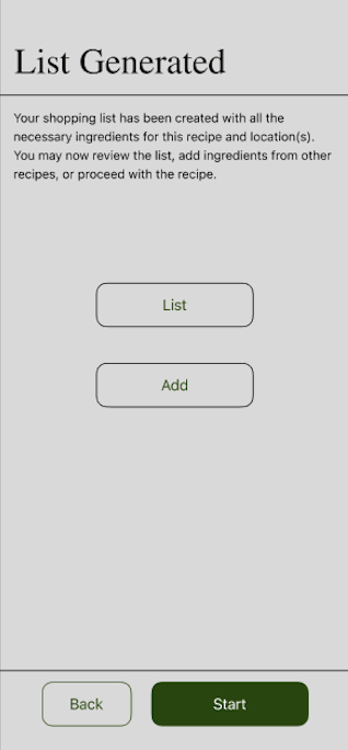
Finally, the rest of the process remained the same with minor add ons and adjustments to provide better clarity when wanting to review the list, add more, or proceed to the steps.
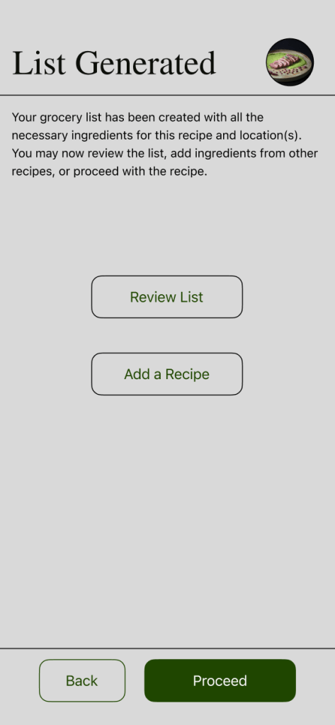
With this updated revision, the process of generating a grocery list is clearer and understandable. By making the add icon much more legible, clarifying directions, and reducing the process, users are able to follow through a smoother navigation.
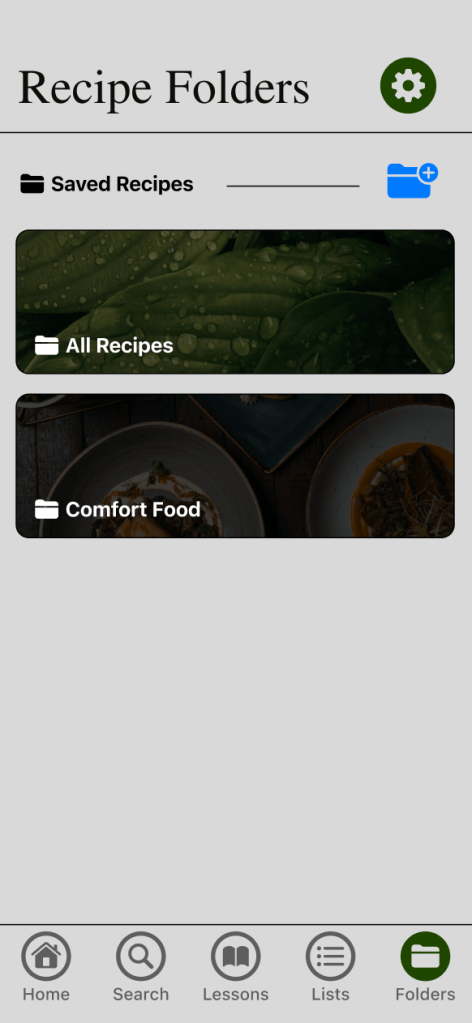
Usability Issue 2: Changing the profile section into a folder section.
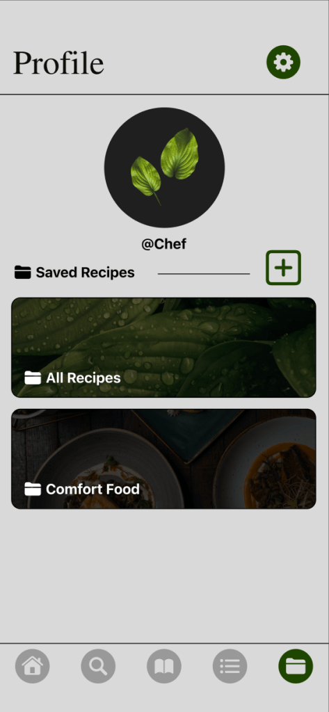
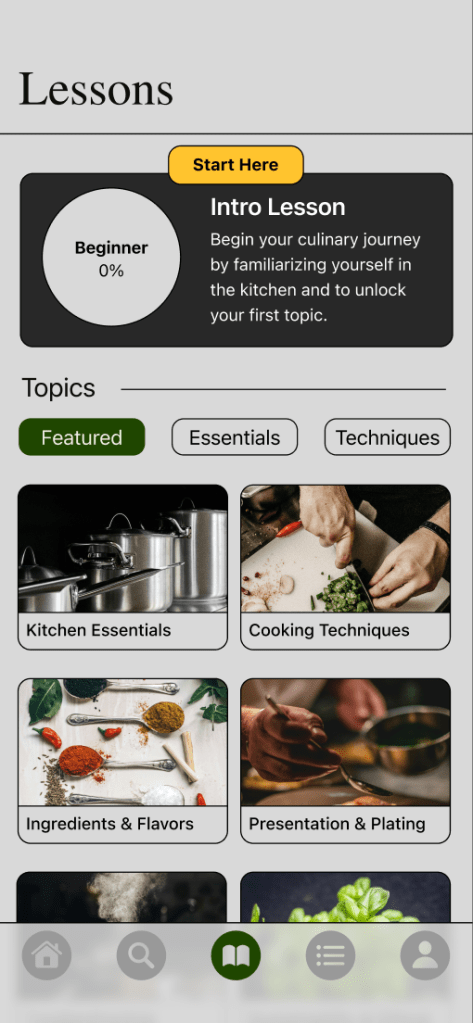
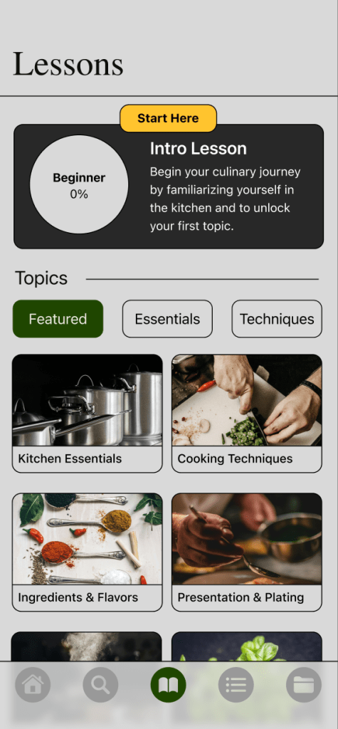
Participants struggled to locate the folder feature to create and store saved recipes, but once located, they were able to complete the task. First, the navigation bar consisted of a profile icon on the bottom right side of the screen, where the folders were located. It is now replaced by a folder icon.
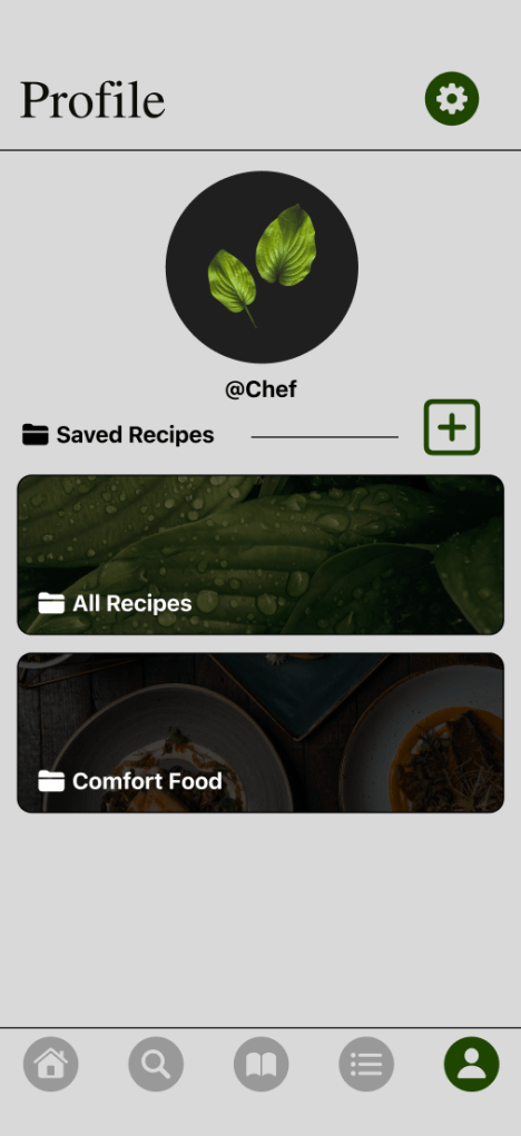

Next, when tapping on the folder section, it originally showed the user’s name, picture, and the folders below it alongside an add icon. The profile aspects have been removed to allow better focus on the folders, and the add icon was changed to blue and to one that consists of a folder.
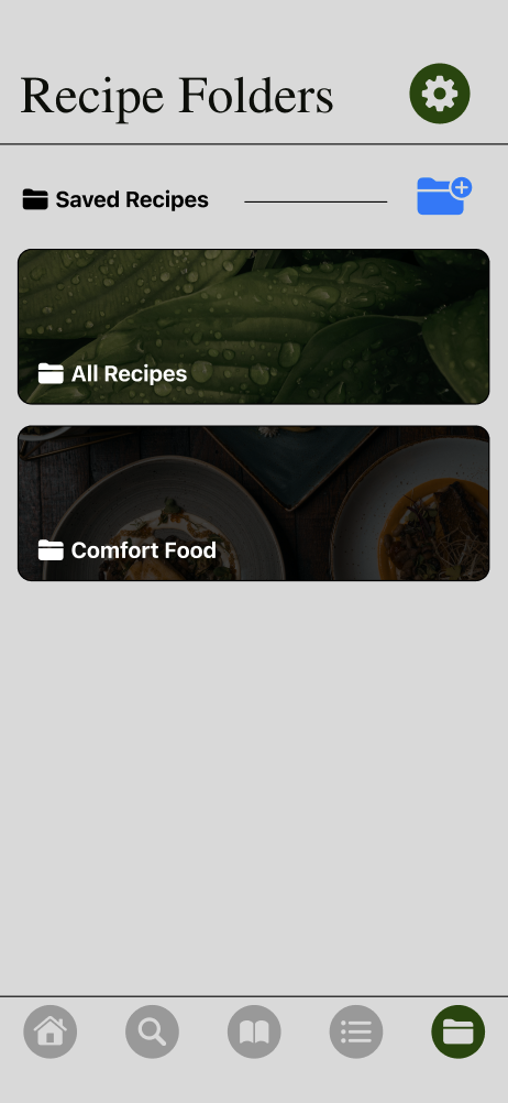
By making the folder section much more visible by replacing the profile section, users can quickly recognize and locate the section. Creating a new folder is easier to see with the change of icon as well, making this process more efficient.
Accessibility issue 1: Buttons & Tap Targets – Increase Button Size and High Contrast Colors
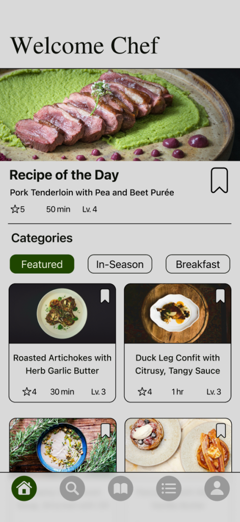
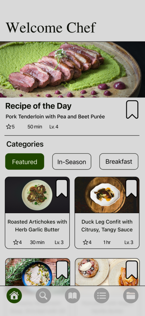
The majority of the buttons throughout the screens meet the required minimum of 44×44 px, with a few areas needing a resize. The first area is the category of topics, such as selecting types of dishes or lesson topics. In addition, the bookmark icons were below the minimum, so they were readjusted as well.

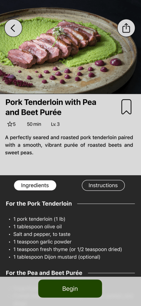
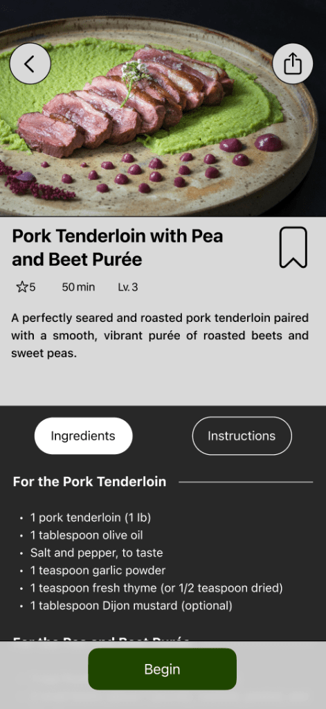
The next area is the tab sections when viewing a specific recipe. The ingredient and instruction tabs are slightly small in height, so they were resized, including the padding for the text below them.
The third area is the editing section when generating a grocery list. Originally, users can tap on the single line of text to cross off the ingredient from the list that they already have. The tap target was very small, and the contrast of the crossed text was limited. To keep it consistent, it was replaced by the same layout of the grocery list, which has a larger area to select or deselect ingredients.
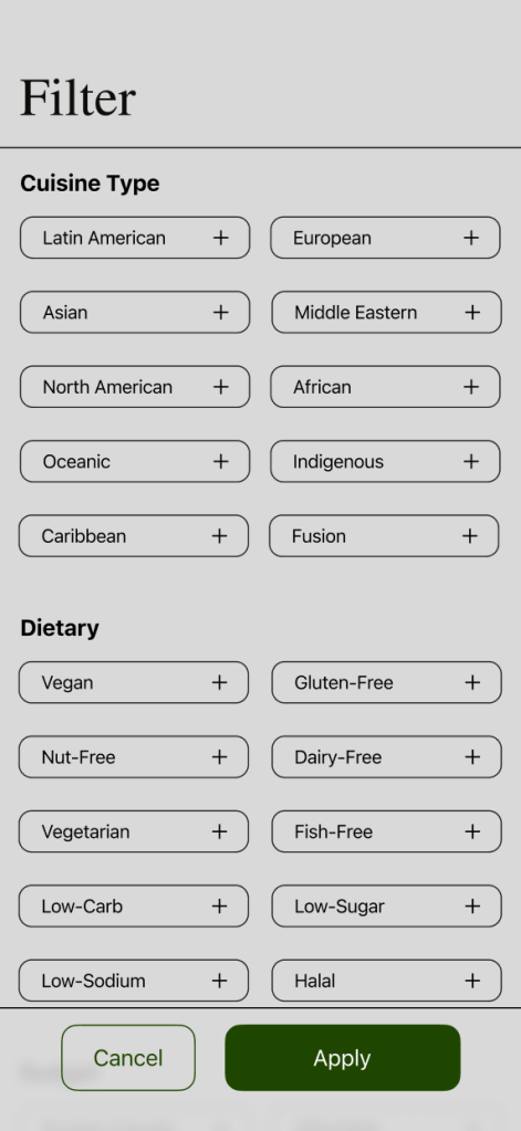
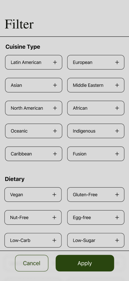
The fourth area is the filter section. The boxes are below the minimum requirement, so they were resized.
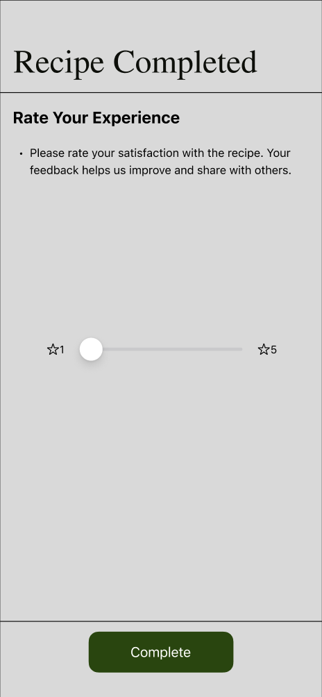
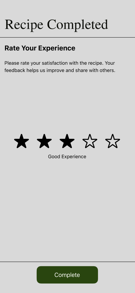
The last area is the rating section. Participants either did not interact with the sliders or found it difficult to interact with the button. It’s replaced with star ratings for a bigger area to tap.
The majority of buttons and tap targets use high-contrast colors. The only area that needed to be updated was the navigation bar with the icons that aren’t selected. A darker grey is applied to reach the minimal contrast as well as becoming unfilled to visually allow the selected filled icon to be seen more. Overall, this has allowed many of these sections to be much more accessible and easier to interact with.
Accessibility Issue 2: Images and icons – Adding alt text descriptions, avoiding text inside images, and using recognizable icons.
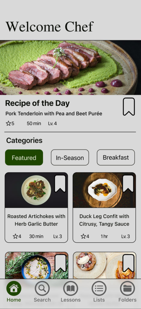
The prototype was made in Figma, which does not support alt text function, however, the majority of images consist of a title and description that helps clarify what kind of recipe it is. There are some areas, such as the step-by-step guide, where there are images, but they are considered decorative or provide a basic visual to support the steps that are laid out.
For avoiding embedded text in images, text layers were already being used. There was a slight adjustment for the folder sections as white text was placed on a darken image. Now there is a lighter banner to make the text black and allow for better contrast and legibility and the darken images are now lighten.

As for the icons, they originally did not have labeling as the majority were recognizable. Nevertheless, the navigation bar will now have labels for better clarity and navigation.
By being detailed with the images and labeling, it helps reduce the hurdles and challenges of navigating and understanding what the recipe consists of without having to only rely on the visual.
What Have I Learn about Usability and Accessibility
It has been very help to understand the standards for consistency, legibility, and inclusivity. The feedback given uncovered areas of the app that didn’t meet personal expectations. It provided a better understanding of the users’ thought processes, whether it is verbally or by observing their actions, it help uncover the sections that needed improvement and areas that worked. I was able to see how challenging and confusing it was to generate a grocery list as well as seeing how participants were locating the folders section. It allowed me to improve upon those features, what should be added, modified, adjusted, and even remove to make a better experience.
As for accessibility, it provides adaptability for alll users such as those with permanent, temporary, or situational limitations as it helps develop a habit when designing any kind of app. I uncovered areas such as certain buttons, options, and layout on certain screens that didn’t meet the requirements, such as sizing, button contrast, and labeling, but I was able to revise and fix them. In addition, it allows me to see what I have been designing successfully, such as text size, overall contrast, clear typefaces, placements for inputs or forms, and staying consistent with the layout of the app. By making it a custom to follow the standards of usability and accessibility, it pushes me as a designer to create impactful and effective designs.
 MARLEN SARMIENTO
Leave a comment