SereniPets Case Study
Project Brief
Create an app that can benefit and help a civic issue or social service by using Figma. It must leave a positive impact, be a resourceful tool, or change through improvement, efficiency, and awareness. Working with a group, the app must understand the user’s needs while working on creating an effective interface following Apple Human Interface guidelines Throughout the process, there will be brainstorming, proposal, exploration, flow chart, low-fidelity design, high-fidelity production, and prototyping.
Project Proposal
Since the COVID-19 pandemic, there has been a significant surge in mental health crises among the youth due to school closures, disruption of social routines, family illnesses, death or job loss, extended periods of isolation, etc (Stern). About 90% of Gen-Z say they’ve experienced symptoms of anxiety, depression, or lack of motivation due to stress, with only 18% of these individuals going to therapy (Place). In 2019, 30.58% of students reported moderate to severe anxiety and depression symptoms, and 16.24 considered suicide (National Library of Medicine). About 18% of the U.S. population and ⅓ of Gen-Z turn to social media for healthcare advice (Pharmaceutical Executive).
Certain health organizations such as the UK’s National Health Services and the U.S. National Institute of Mental Health highlight that mental health apps are cost-effective and scalable solutions to addressing the mental health treatment gap (National Institutes of Health). Gen-Z needs a personalized space catering to mental health in a private, affordable, and convenient way. The “SereniPets” app aims to help Gen-Z work on their mental health using a virtual pet alongside providing various resources like a therapist, a social hub, a planner, and lessons. Creating an app that houses multiple options under one roof will help with incentives for the improvement of well-being post-pandemic.
Feature & Contributions
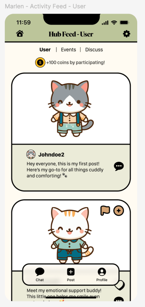
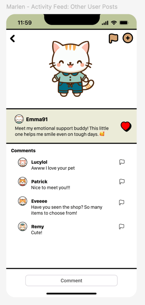
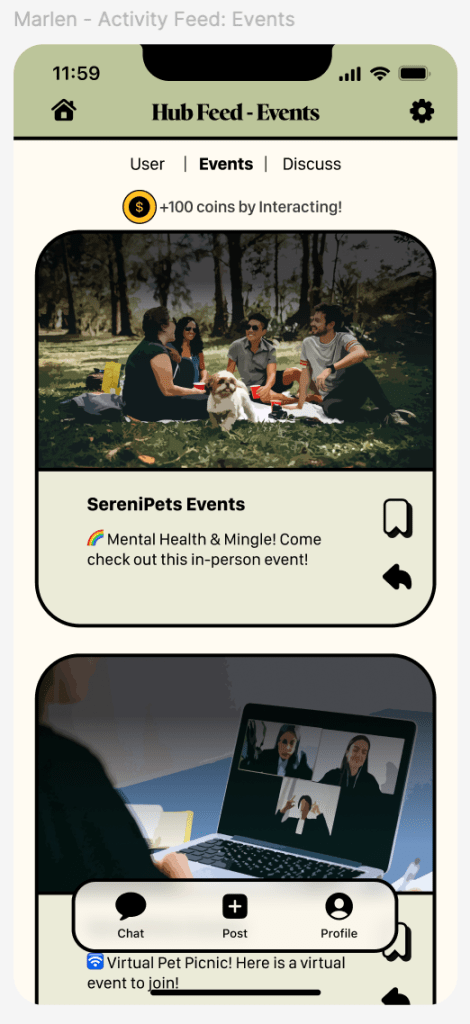
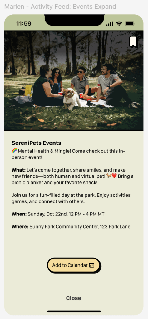
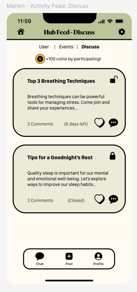
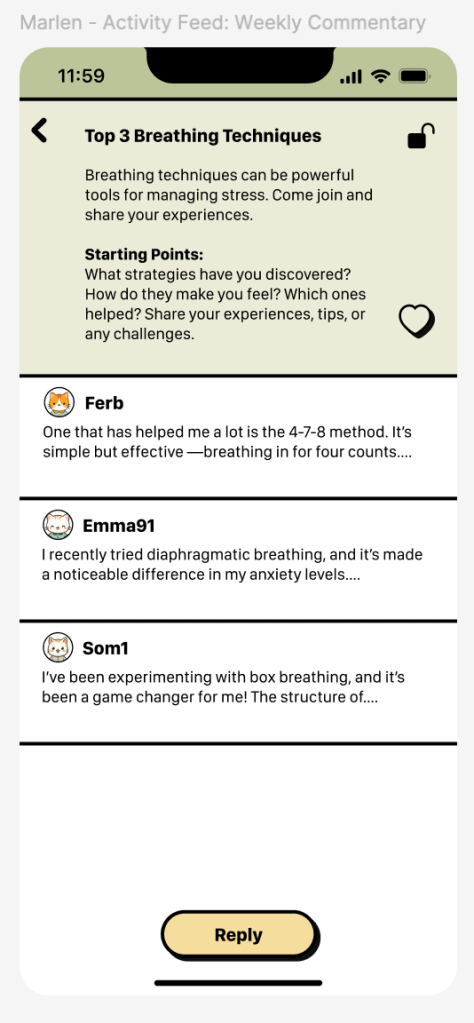
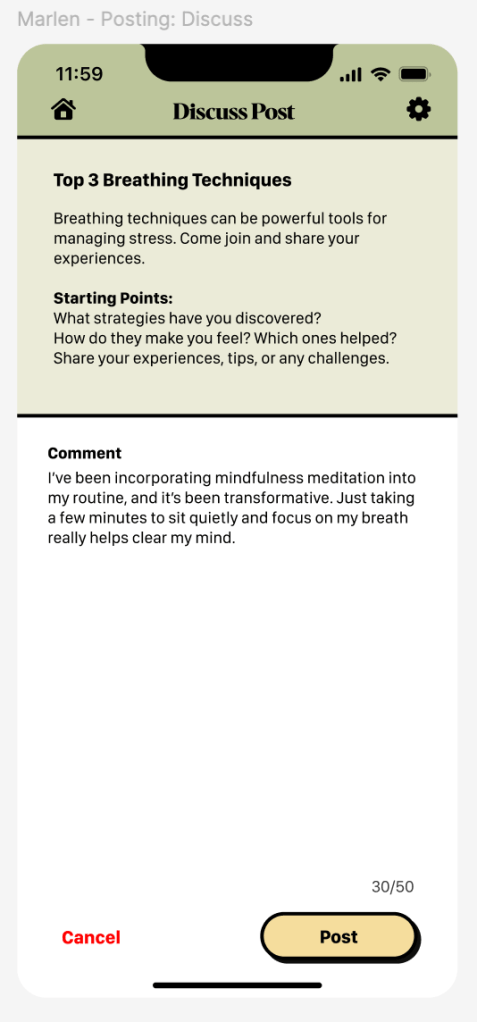
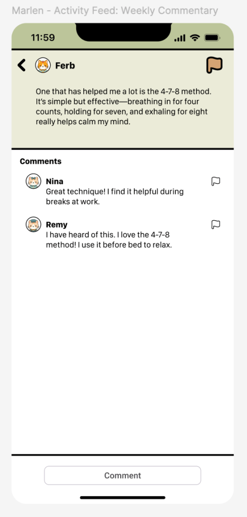
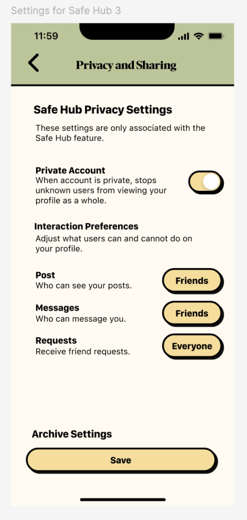
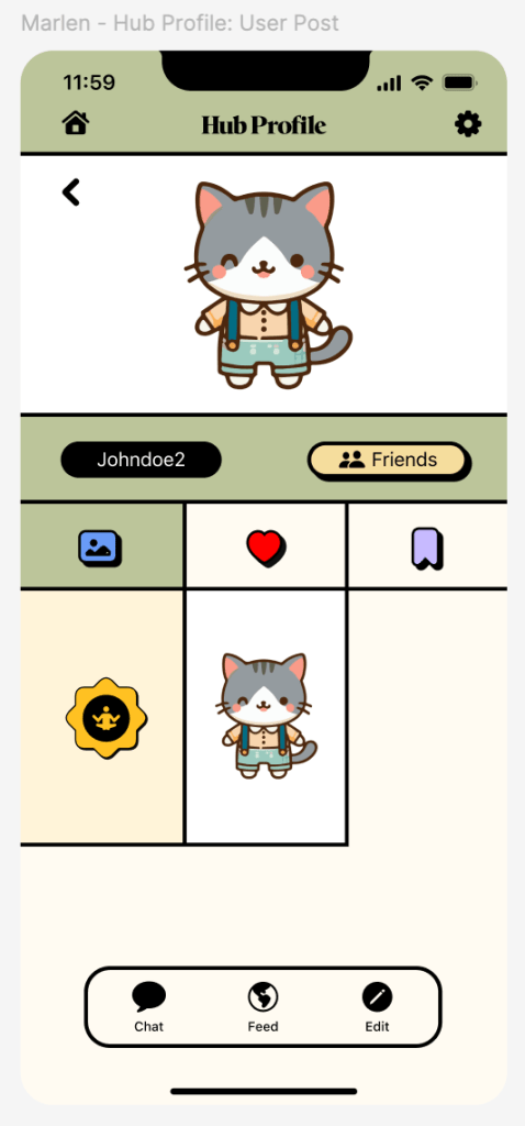
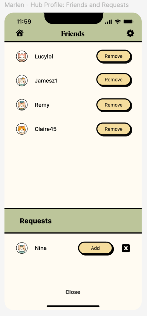
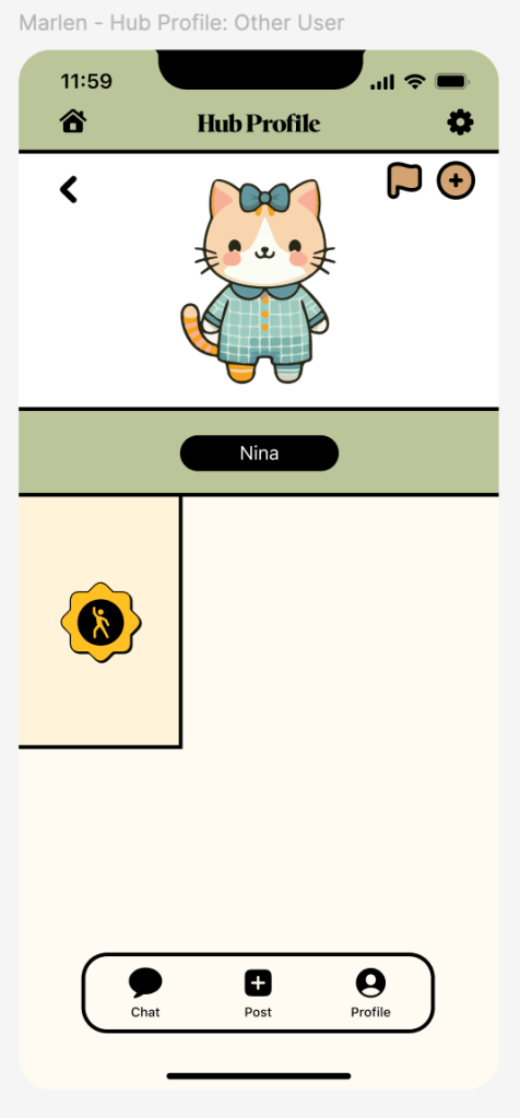
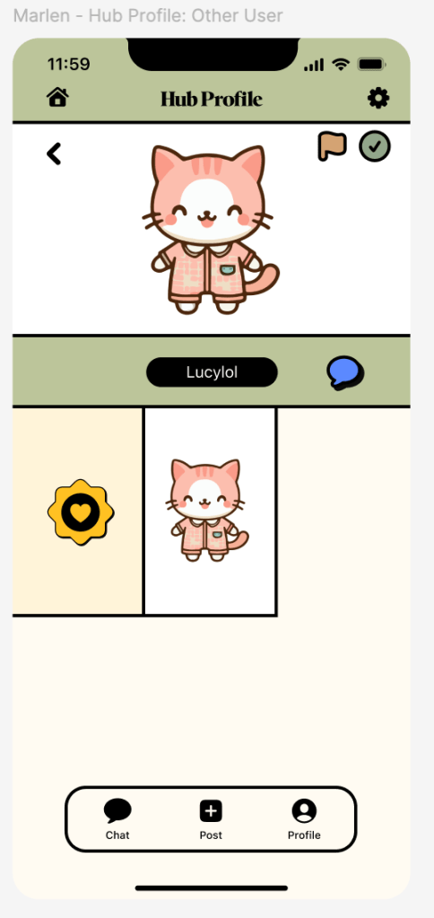
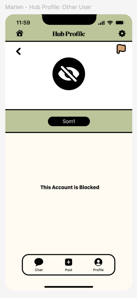
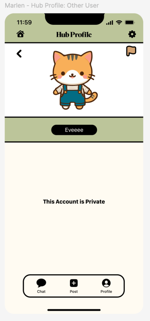
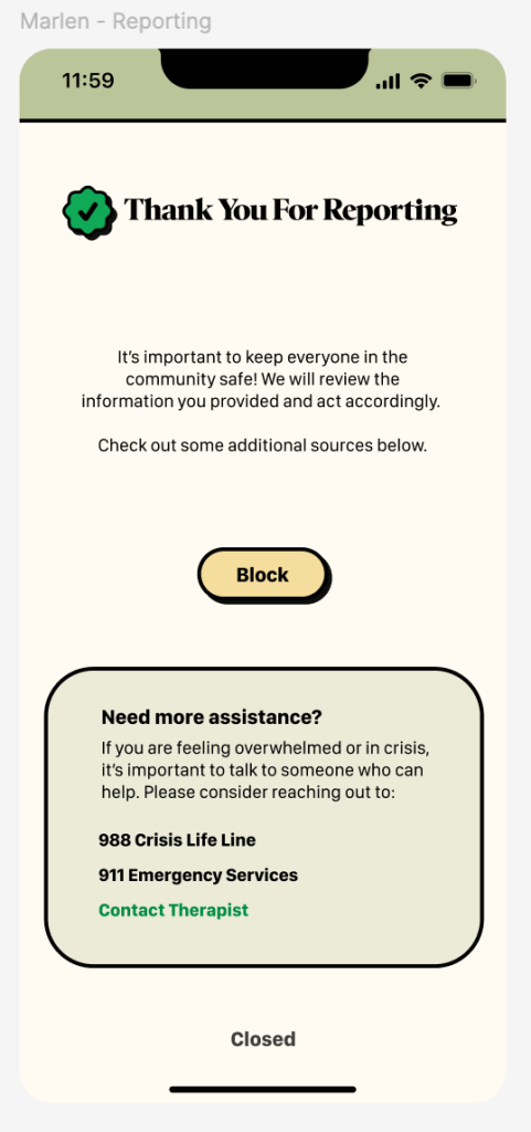
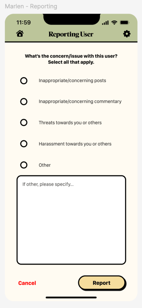
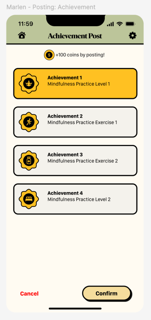
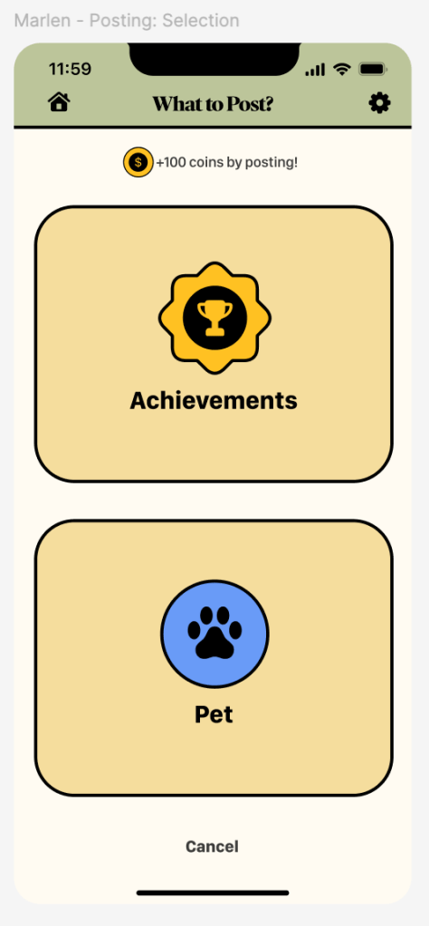
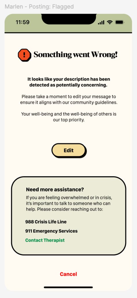
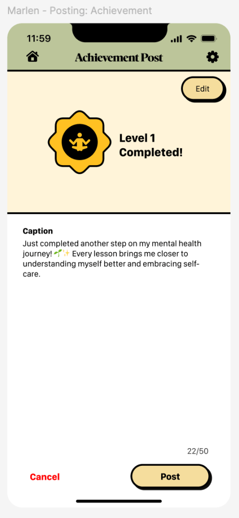
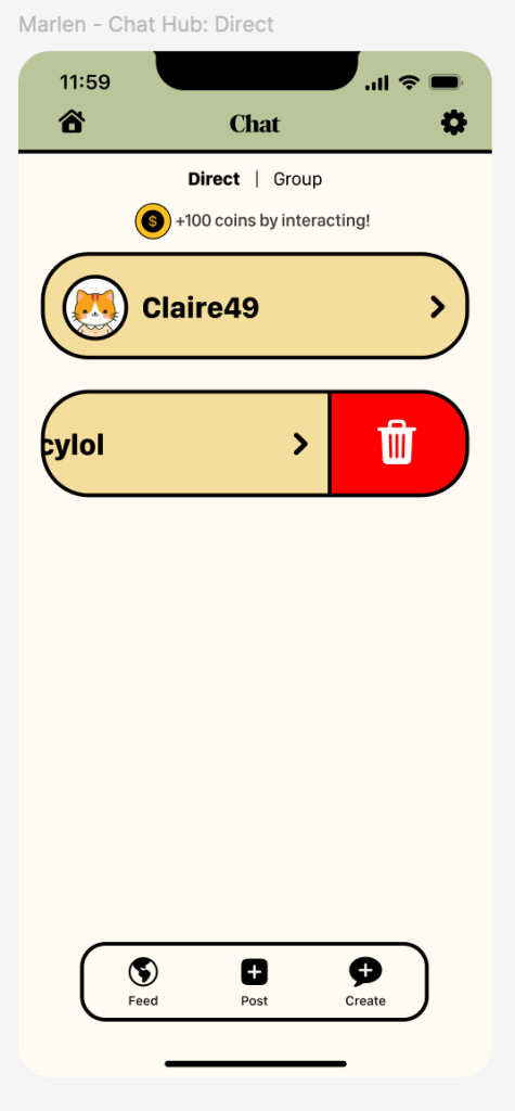
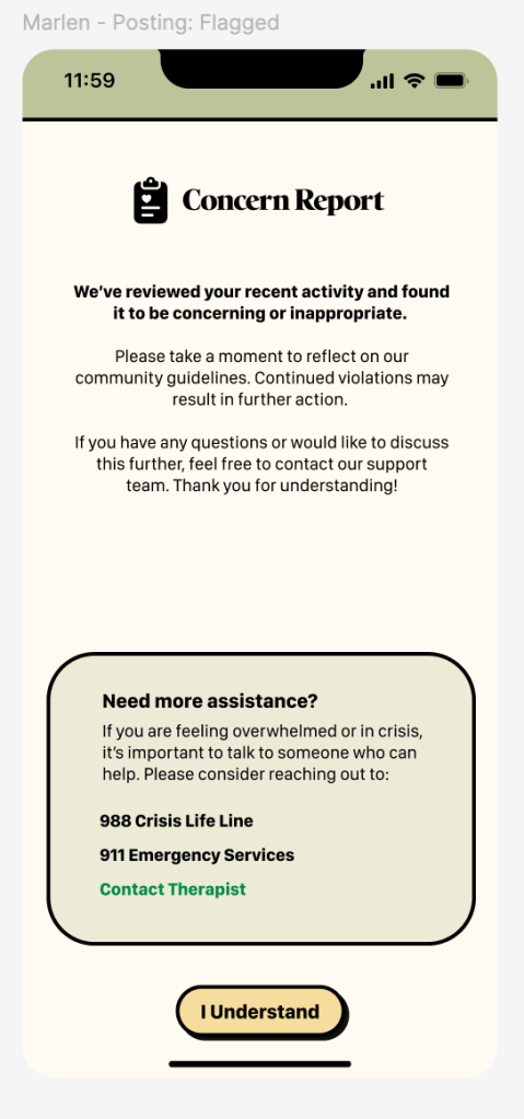
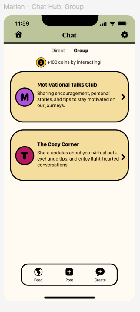
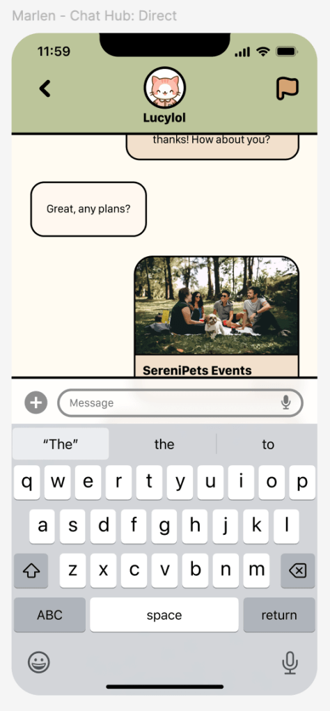
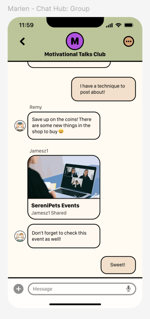
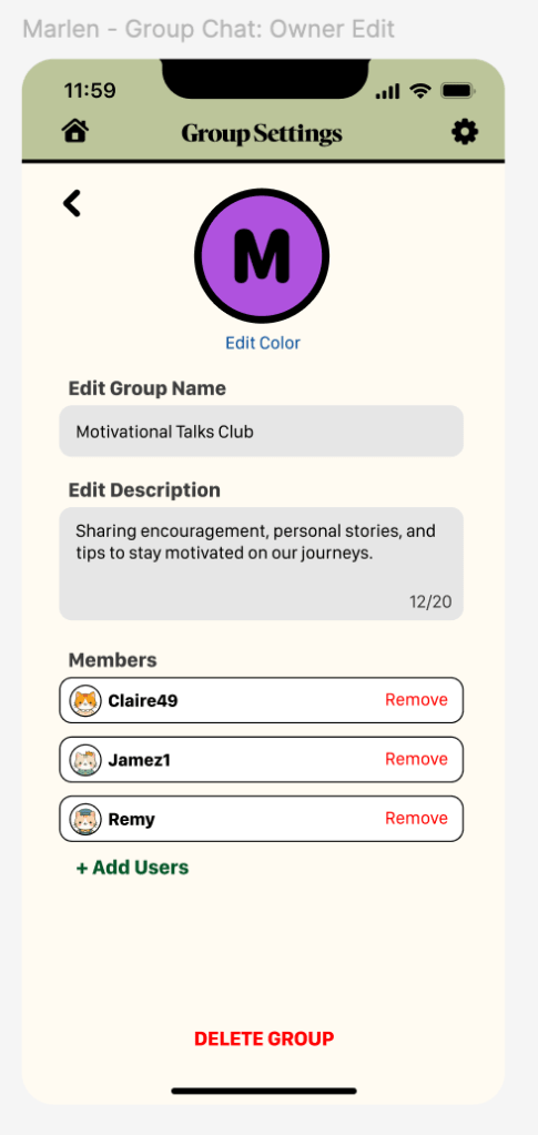
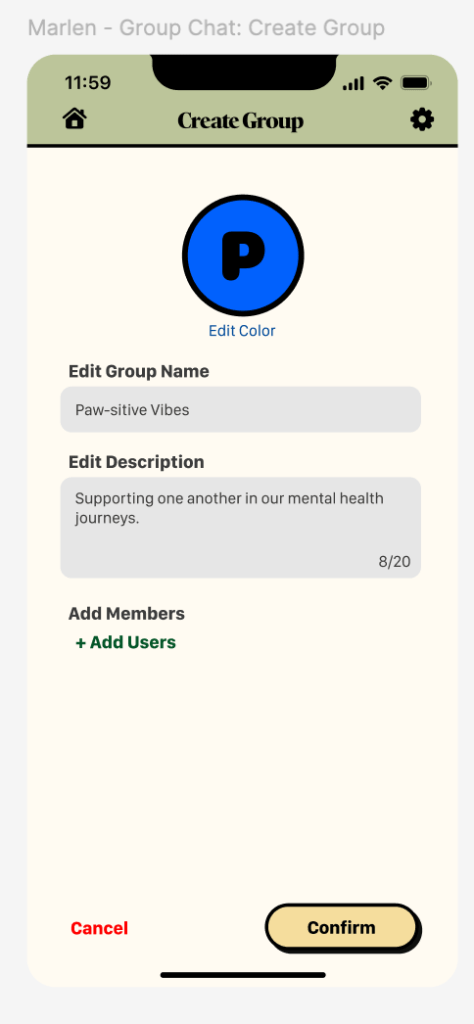
I created the “Social Hub” feature using Figma for the SereniPets App which is an online hub for users to interact with others post their achievements, virtual pets, befriend, chat, sign up for events made by the app, and take part in discussions. I wanted a space for community building revolving around engagement, encouragement, motivation, and consistency. The feature provides a small profile to hold all the posts, likes, and saves. To keep the community safe there are measures taken such as the app detecting and flagging posts before they can be posted and a reporting system for users to take action. The hub allows for a chance to reach out to others and be part of a supportive community to reduce the isolation that resulted from the pandemic. The content seen is geared towards what is provided by the app. In-app metrics are user engagement, accomplishments earned and shared, consistency, and community building. In-person metrics are attendance for in-person events, follow-ups, volunteering, and satisfaction with users feeling accepted.
In the early stages, I first helped with research and finding sources such as “Generation Z is Waging a Battle Against Depression” by Place and “Delivering Mental Health to Gen Z” by Stern. As the semester progressed, I communicated a lot more and provided rundowns for those who couldn’t make it to the meeting. I helped find ways for certain features to connect to my feature and vice versa when working with low-fidelity designs. When there were challenges, I took the opportunity to provide various compositions to choose from when it came to how the app might look including the homepage, primary and secondary typefaces, icons created by Apple, suggested loading screens for each feature, an icon for the app, and creating high fidelity screens for the first 3 screens when opening the app.
Through this process I always took into consideration on the design elements we agreed upon and low-fidelity designs. I made the revisions from the feedback given for my feature and through the main app which includes users signing in/up, forgetting passwords, sliders for a survey, the homepage with the menu for the features, and a tutorial page. When prototyping, I helped connect the main app from the process of signing up to the homepage and made certain screens such as the keyboard pulling up and the hamburger menu sliding in. I also focused on the small interactions including tapping any area that requires input to have the keyboard pop up and when tapping the Face ID there is a small animation as the icon appears before entering the homepage. I made functional buttons such as the toggle and sliders. Finally, I also made achievement badges for another feature and mine to help connect when it comes to posting.
Design Research & Planning
Competitive Analysis
Through the competitive analysis, 3 apps which are Headspace, Pokipet, and Wysa were compared and analyzed. Headspace is a popular meditative app that targets any individual interested in working with their mental state through lessons, however, it lacks resources in reaching out to professionals, isn’t fully personalized, and is overall broad. Pokipet, is towards entertainment for younger users who require care for a virtual pet, however, progression and personalization is limiting. Finally, as for Wysa, it works with young adults who are dealing with depression, anxiety, or other stressors by providing virtual assistance, routine support, courses, and journaling, however, AI takes route in the assistance which can lack empathy and much-needed human emotion and interaction at times. Taking these app’s strengths and weaknesses into consideration will allow it to cover areas in the SereniPets app that the competitors cannot such as having various opportunities for users to navigate their own personalized mental health journey, reaching out to professionals, keeping track of certain routines, and connecting with others alongside a virtual pet.
Flow Chart & Low-Fidelity Screens
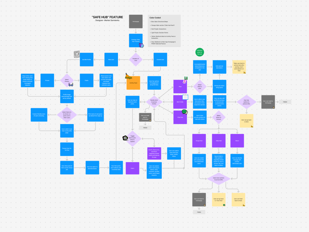
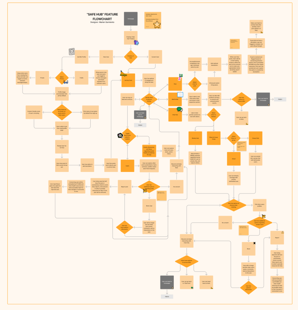
I created a flow chart to show an overview of my feature, “Safe Hub,” which covers what to expect when a user enters, navigates through it, and exits. It is divided into two major sections, one for current users and a tutorial for new users. Through feedback, the original flowchart expanded and covered additional areas including a reporting/flagging system. For new users, they are guided through the functions of the feature as they are tasked to post their virtual pet. When opening for current users, they are greeted by the Activity feed with further options in which they can like, share, comment, post, and chat with fellow users.
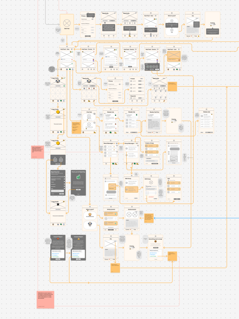
Low-fidelity screens were made to help better visualize, and organize components, and provide a clearer outline of the final product as guidance. This also includes taking the opportunity to connect certain screens to other features and revising additional feedback given.
Individual Screen Designs

Prototype Walkthrough
Figma Prototype
Areas of Improvement
Shortcomings
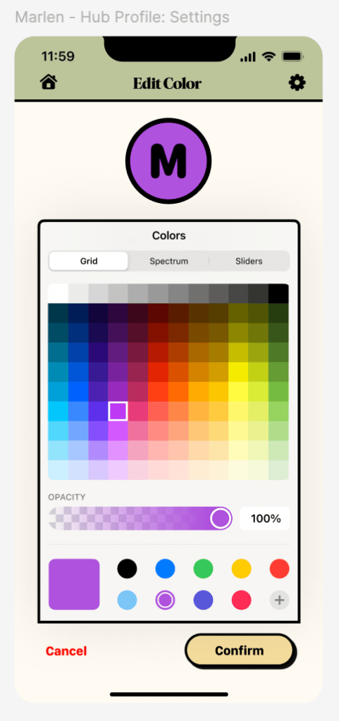
There are a few shortcomings in my design to consider. First are areas that should have provided more content and more variety to explore as if the app has been available for a longer period of time. This includes additional posts or comments from users, events, and discussion prompts. This helps better envision how the amount of information can be effectively organized without feeling too overwhelming on the screen. Second, is through prototyping, such as color selection and finding other ways to pick the color of the group. Third is places in user can undo such as when editing the user’s profile and having to either double confirm what has been deleted or cancel the edit. Fourth is adding external links when providing options such as events or for users to reach out to when in need of assistance, rather than sold text they can be links that redirect the user.
Areas of Improvement for the Overall App Design
One area of improvement in the overall app design is the consistency. Overall the content, and basic elements such as the color palette, buttons, navigation, typefaces, and the user’s pet are mostly consistent. There are slightly different transitions when moving across screens as well as how screens are organized. Another area would be having a few more tutorials available to better clarify for new users which can clear some questions that can come up when it comes to usability testing.
Refinement
There are some aspects that still require refinement in my feature. First are parts in which the backing to the previous screen can create various tabs “open” unless the user taps the navigation options to rest their position. The second is adding more subtle animation in some areas such as liking and saving a post where the icons slightly pop in and out. It would allow for more expression and liveliness. Third is trying to reduce the text in some areas in which users must select to see more of the text whether it is the discussion prompts, group chat description, etc.
Testing & Validate
I can always test or validate my design through usability testing and seeing any form of mishaps that went under the radar. Having others see the app without any context when first being introduced to it, can allow us to see mistakes or issues that might come across as well as what works and possibly answers any concerns that arise.
Sources & Citations
Chandrashekar, P. (2018). Do mental health mobile apps work: Evidence and recommendations for designing high-efficacy mental health mobile apps. Retrieved from https://www.ncbi.nlm.nih.gov/pmc/articles/PMC5897664/
Chris Lee. (2023, March 20). Latest Federal Data Show That Young People Are More Likely Than Older Adults to Be Experiencing Symptoms of Anxiety or Depression. KFF. https://www.kff.org/mental-health/press-release/latest-federal-data-show-that-young-people-are-more-likely-than-older-adults-to-be-experiencing-symptoms-of-anxiety-or-depression/
Panchal, N., Saunders, H., Rudowitz, R., & Cox, C. (2023, May 20). The Implications of COVID-19 for Mental Health and Substance Use. KFF. Retrieved from https://www.kff.org/mental-health/issue-brief/the-implications-of-covid-19-for-mental-health-and-substance-use/
Place, A. (2023). MENTAL HEALTH: Delivering mental health to gen Z: Ninety percent of gen Z say they’ve experienced symptoms of anxiety or depression due to stress. Employee Benefit News. Retrieved from https://research-ebsco-com.aurarialibrary.idm.oclc.org/c/qjh3nm/viewer/pdf/cj4iajbjur?modal=cite
Stern, C. M. (2023, June 9). Generation Z is Waging a Battle Against Depression, Addiction and Hopelessness. Walton Family Foundation. Retrieved from https://www.waltonfamilyfoundation.org/stories/foundation/generation-z-is-waging-a-battle-against-depression-addiction-and-hopelessness
Gen Z and Millennials Turning to Social Media for Health Guidance Instead of HCPs. (n.d.). PharmExec. https://www.pharmexec.com/view/gen-z-and-millennials-turning-to-tiktok-for-health-guidance
Haikal. (2021, April 20). Evolution of Instagram’s UX & UI. Medium. https://haikalrzn.medium.com/evolution-of-instagrams-ux-ui-6f8cced3f1f
Cheung, J. (2023, October 9). Why the Tiktok UI Is So Good. CareerFoundry. https://careerfoundry.com/en/blog/ui-design/tiktok-ui/
Apple. (n.d.). Human interface guidelines. Apple Developer Documentation. https://developer.apple.com/design/human-interface-guidelines
Figma. (2023, February 24). Figma 101 [Video]. YouTube. https://youtu.be/CNQ_N7Pvyag?si=g8u2CHiiB-LnO-W0
Figma. (2024, March 18). Figma 201 [Video]. Youtube. https://youtu.be/5w2_D6uDv3o?si=K-pexjp5DvpKWe7I.
Contrast checker. WebAIM. (n.d.). https://webaim.org/resources/contrastchecker/
S. (2019, March 18). The importance of prototyping in designing. Medium. https://uxdesign.cc/importance-of-prototyping-in-designing-7287c7035a0d
Hulslander, A. (2023, August 13). UX – App Prototype Expectations [Video]. Youtube. https://youtu.be/43DxiiB0eGg?si=1mi83ZC-w9hUCg4u
Hulslander. A. (2023, August 13). UX – App Prototyping Rookie Mistakes [Video]. Youtube. https://youtu.be/bmC5aOh3zBY?si=NVHqk8BPp27vA68P
Figma. (2018, February 27). Figma Tutorial: Prototyping (Older Version) [Video]. Youtube. https://youtu.be/-sAAa-CCOcg?si=FSknRn4vOHj8WQGz
Figma. (2020, August 6). Figma Tutorial: Prototyping & Transitions [Video]. Youtube. https://youtu.be/-d6zNGeF59M?si=uBdd66j0baXE6O2k
IOS 17 and IPadOS 17. Figma. (n.d.). https://www.figma.com/community/file/1248375255495415511/ios-17-and-ipados-17
Figma. (2022, March 14). Figma Masterclass for Beginners (2023 Updated) [Video]. Youtube. https://youtu.be/II-6dDzc-80?si=fueZ0Gk1LLcAydHt
Hulslander, A. (2023, August 13). UX – App Design Rookie Mistakes [Video]. Youtube. https://youtu.be/WwLW8NBbVqM?si=mptw_oG_587tVn-Z
Hulslander, A. (2023, August 13). UX – Reasons to Use a UX Design System [Video]. Youtube. https://youtu.be/2C8tD2sl8L4?si=gKebrwiQWqhkfouk
Interaction Design Foundation. (n.d). The Basic of User Experience. Google Drive. https://drive.google.com/file/d/1eoJwzlvbQDPeeIdS8SXs76pIXY_XV2t5/view
Hannah, J. (2024, February 6). What is a wireframe? A Comprehensive Guide. CareerFoundry. https://careerfoundry.com/en/blog/ux-design/what-is-a-wireframe-guide/
Frost, Brad. (n.d). Atomic design. https://atomicdesign.bradfrost.com/table-of-contents/
Hulslander, A. (2024, September 15). 2024 IXD1 Using Figjam for UX Wireframes [Video]. Youtube. https://youtu.be/6O66MwMqZJw?si=MW-8z2HxQxKdYWMk
