Well Savouré Case Study

Project Brief
Responsive design project that addresses a customized app that works across mobile, desktop, and tablet. It allows for versatility and consistency and takes into consideration how different visual elements adapt across screen sizes using Figma to mimic this approach. In addition, taking into consideration the usability and accessibility of the app. This was a solo project and it was laid out into 8 sprints, which include: ideation, strategy document, flow charts, wireframes, prototypes, usability testing, and designing for accessibility.
Proposal
It’s estimated that about 1.1 billion people cannot afford basic nutrition in 2021 (Ritchie, 2024). In the US alone, only around 1/4th of adults have met the standards of healthy living (Myers, 2022). Narrowing it down further, about 3.8 million college students are dealing with food insecurity (“Supplemental Nutrition Assistance Program,” 2024). Whether it is the improper diet, lack of knowledge, costs, or accessibility, food is an essential. The USDA brings up that a poor diet can contribute to obesity, heart disease, stroke, cancer, diabetes, and so forth (Okrent, 2023). Gourmet cooking can be expensive and yet tends to offer high-quality ingredients and essential nutrients. Having high-end and nutritional meals can be the goal in mind, however, the affordability and unfamiliarity of the craft can still place many barriers. Low-income adults need high-quality meals and guidance that will offer affordable gourmet dishes in order to accomplish a nutritional diet.
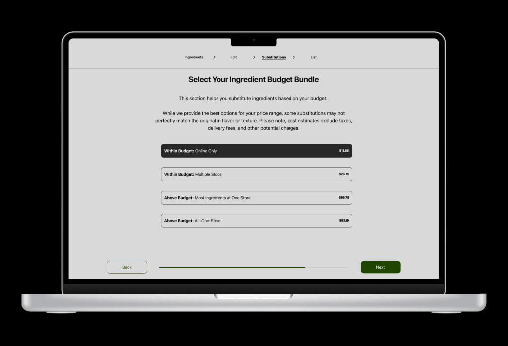
Gourmet dishes and affordability might sound mutually exclusive, however, wanted to have the opportunity explore ways an app can help offer high-end dishes to choose from. In addition, providing ways to obtain the ingredients based on the user’s budget and offering lessons to improve their cooking skills under one roof.
The Approach
The App
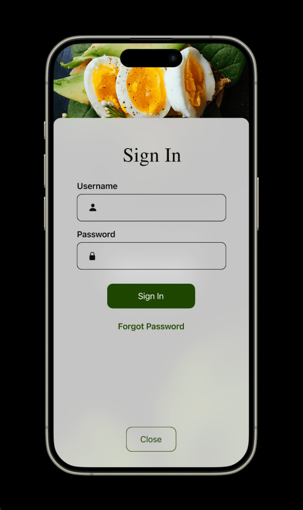
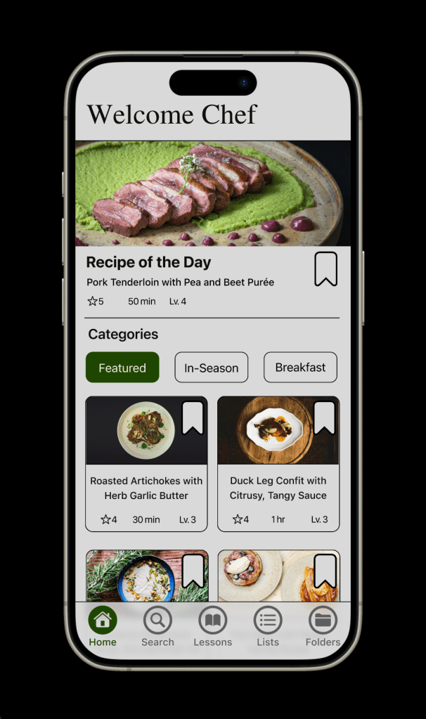
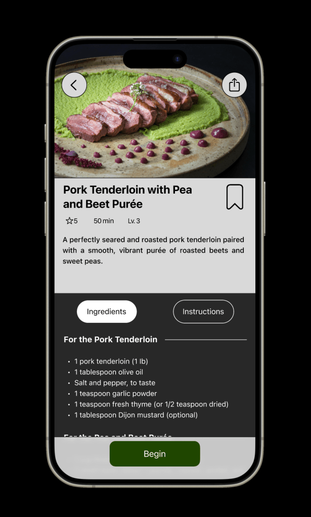
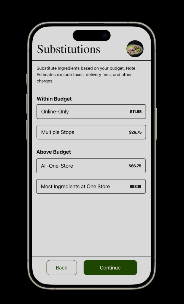
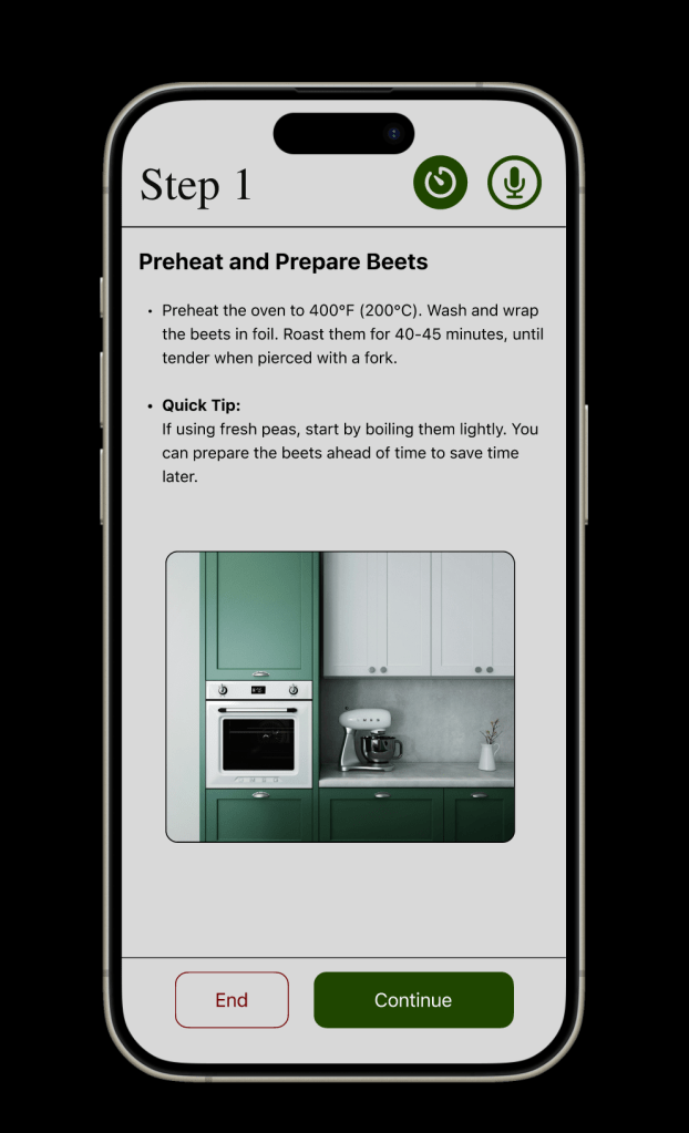
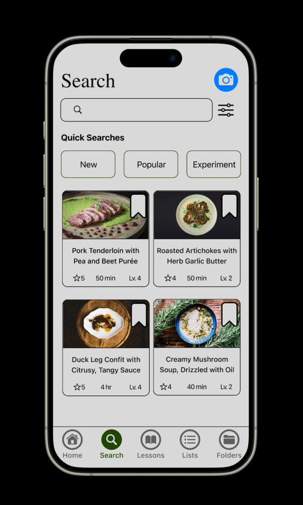
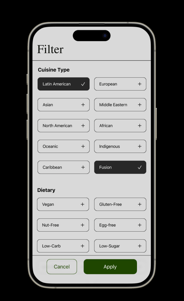
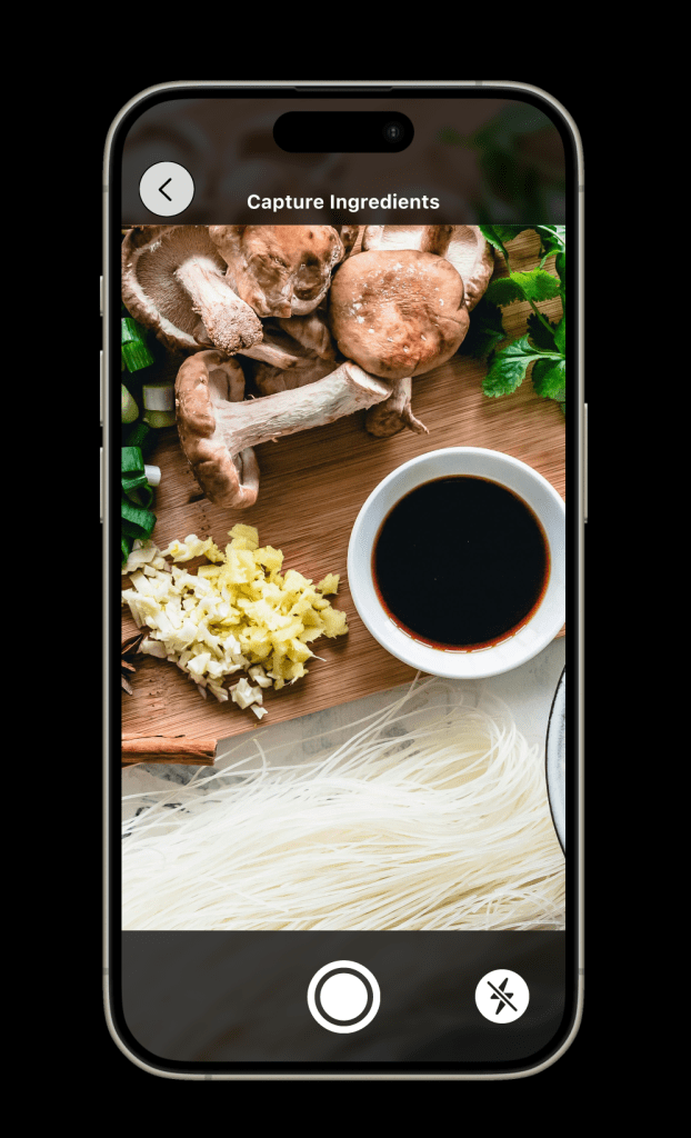
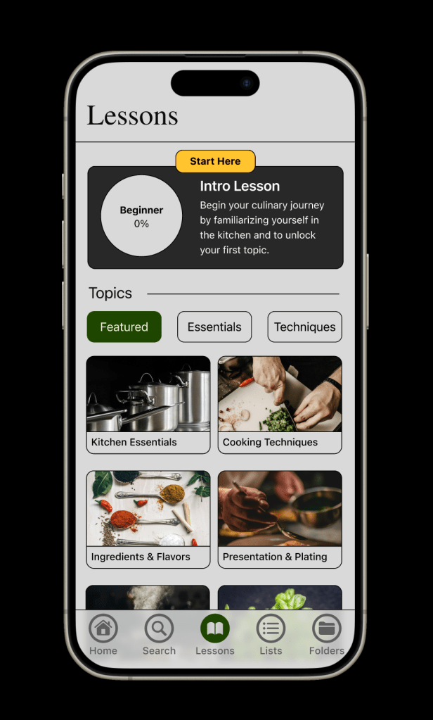
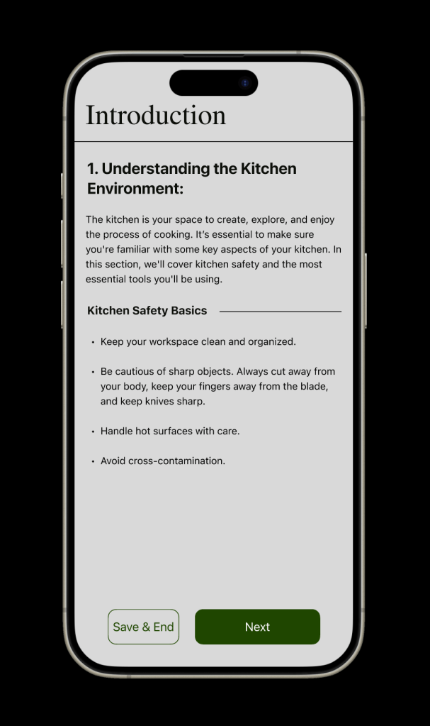
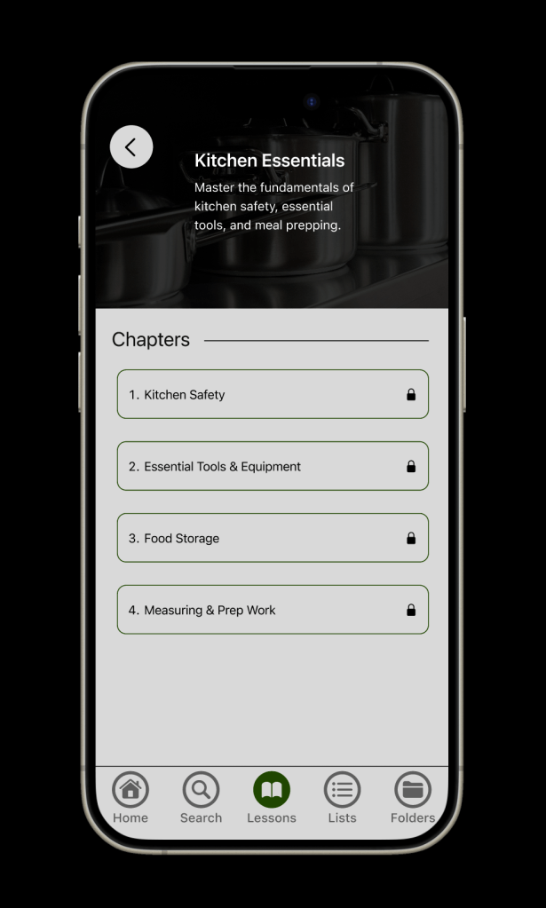
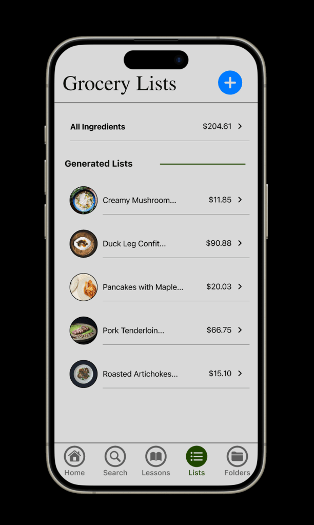
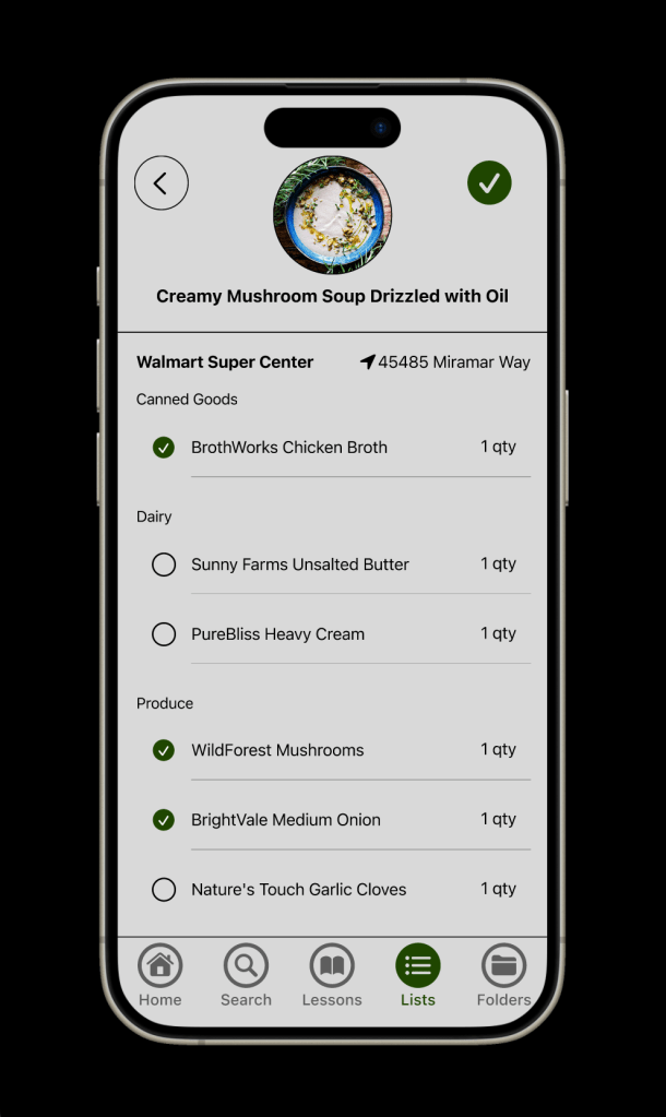
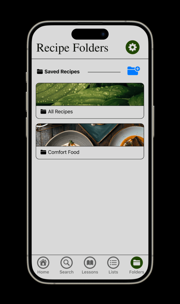
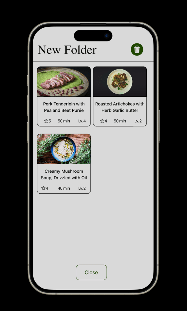
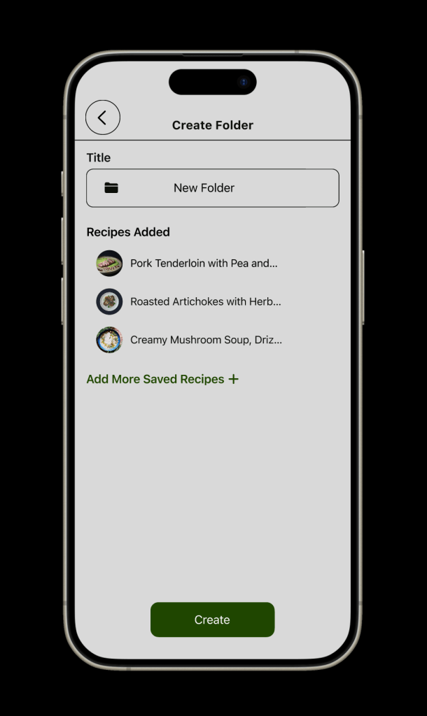
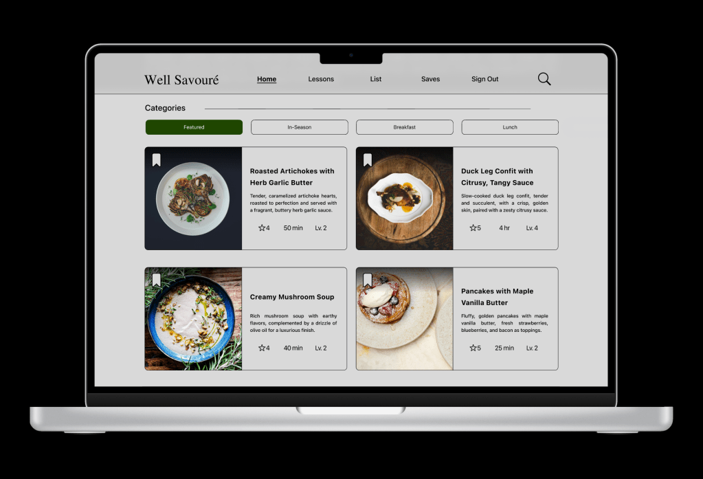
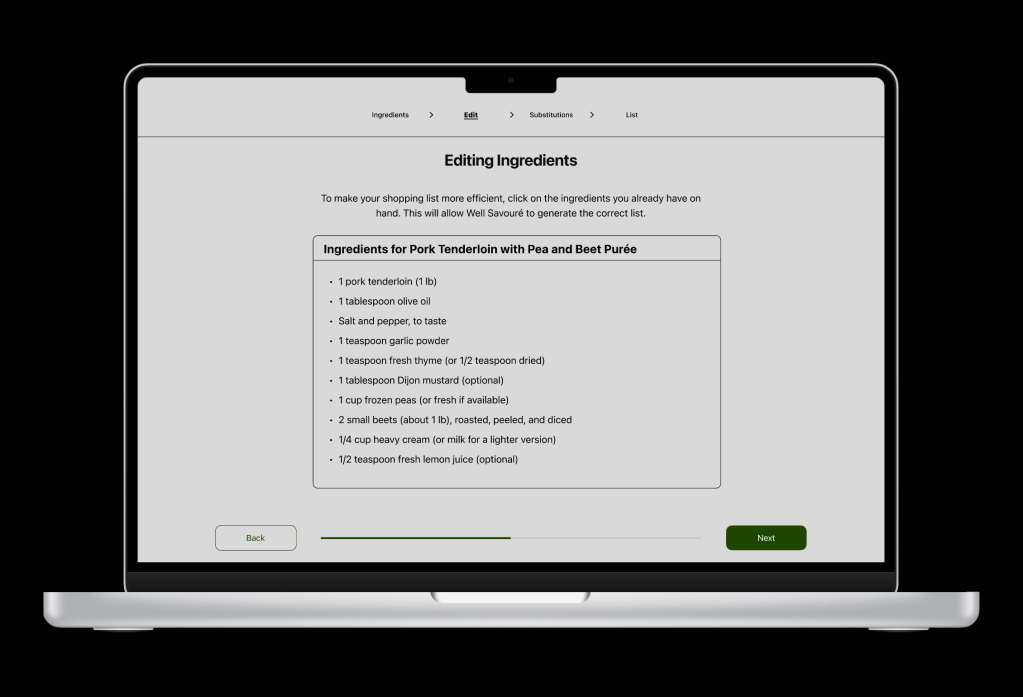
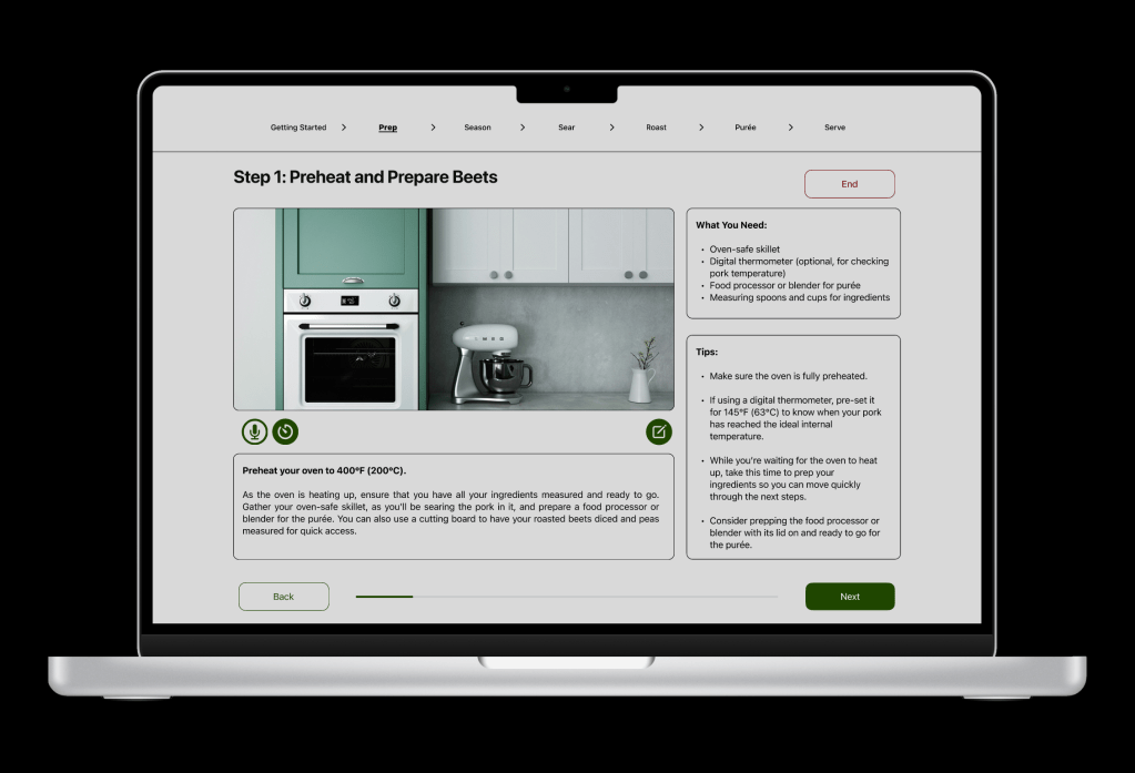
Designed, Well Savouré, an app that allows users to create gourmet dishes with affordability and learning in mind. Features and functions include browsing, ingredient list planning, lessons, step-by-step instructions, sharing, and folders when organizing and bookmarking recipes.
Timeline
Sprint 1-2 (4-week duration) – Responsive Strategy Doc
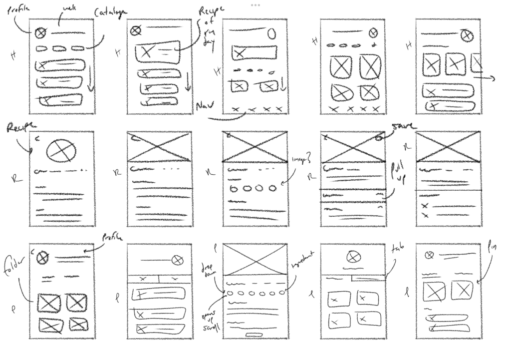
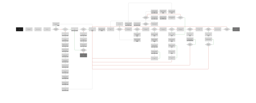
Organize and create a responsive strategy doc that highlighted the research and analysis of the proposal. This also included data to back these claims, primary behavior and demographics of the user, user goals, the selected devices, including their rationale and user tasks for each, a chart that represents what each device can and cannot do, ways to automate, monetize, a flow chart, and wireframe sketches.
Sprint 3-5 (5-Week duration) – Devices Design & Prototype
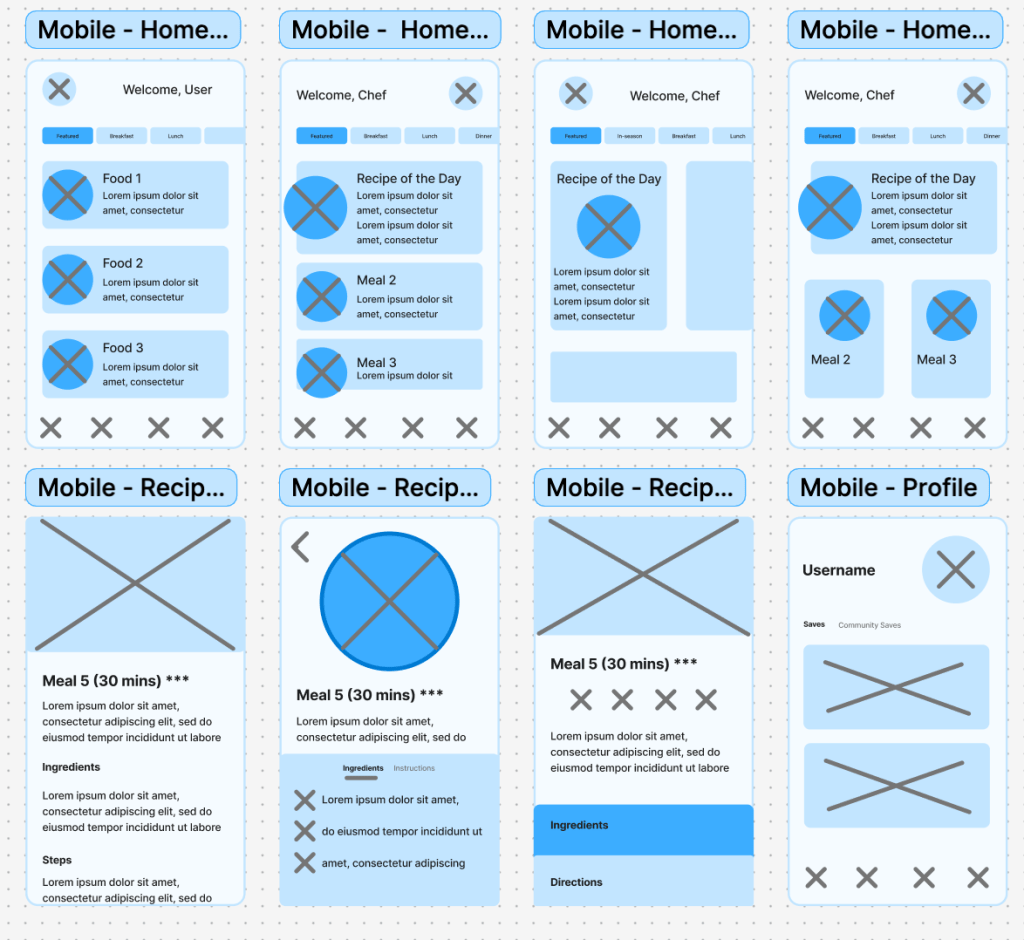
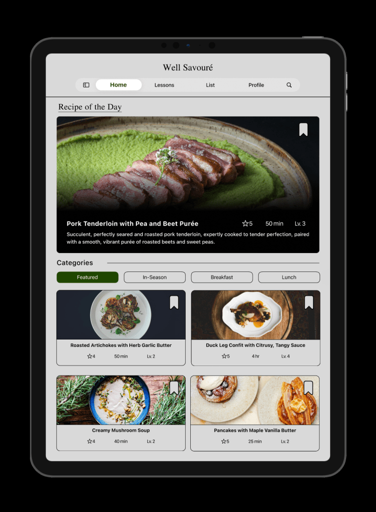
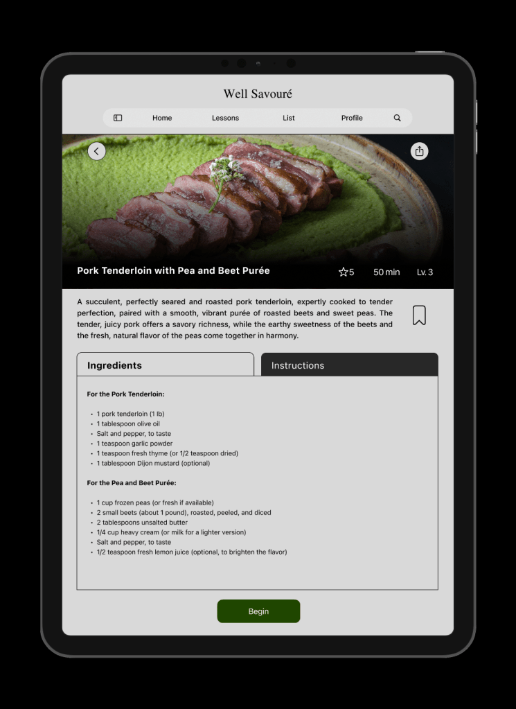
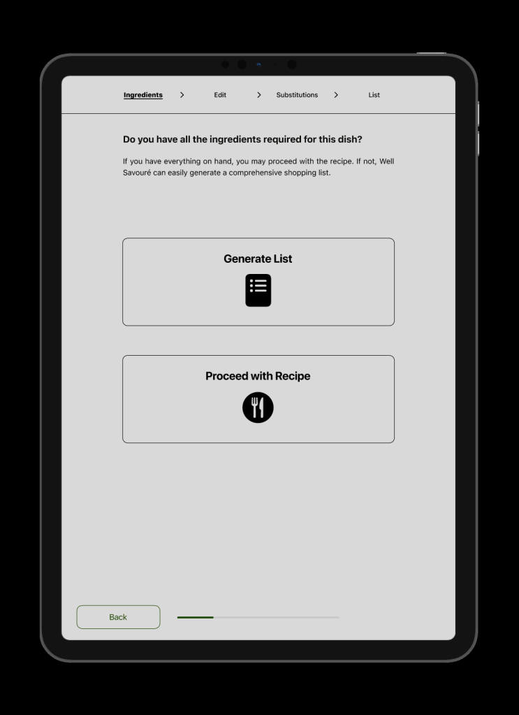
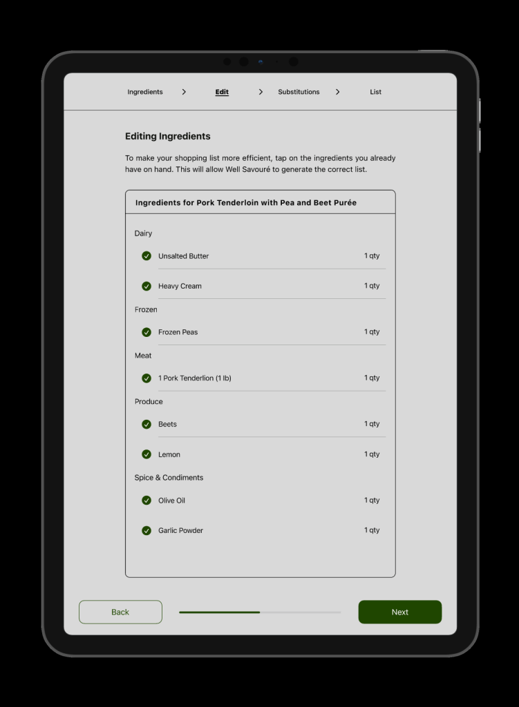
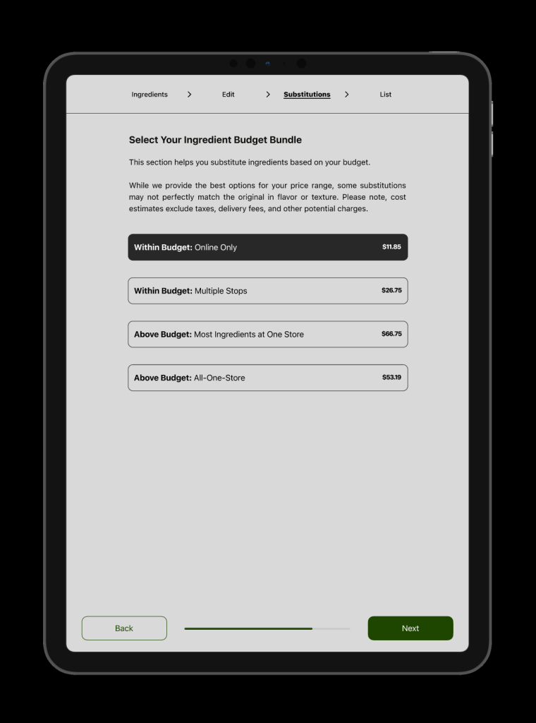
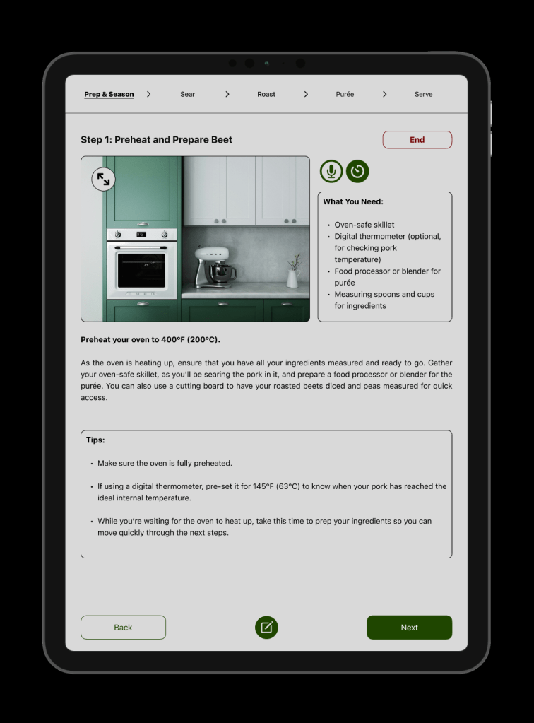
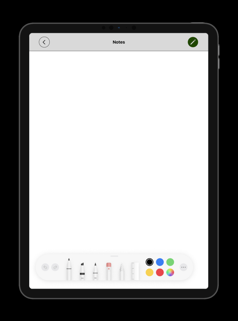
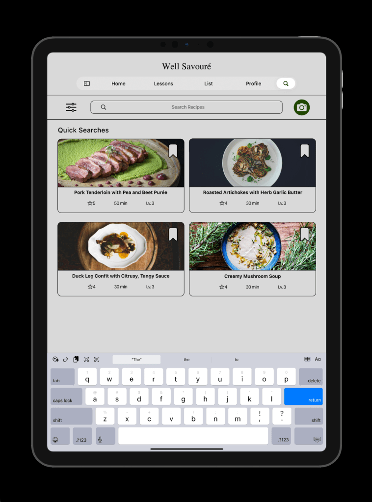
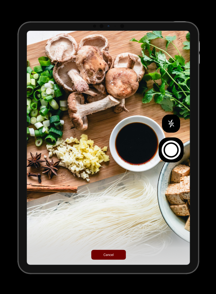
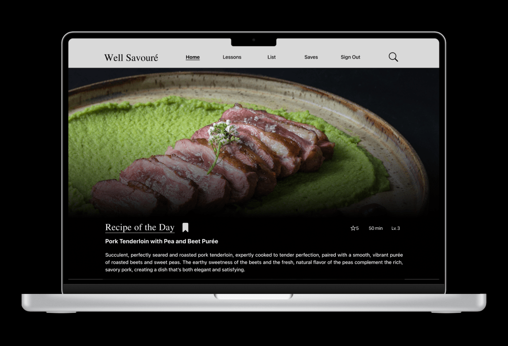
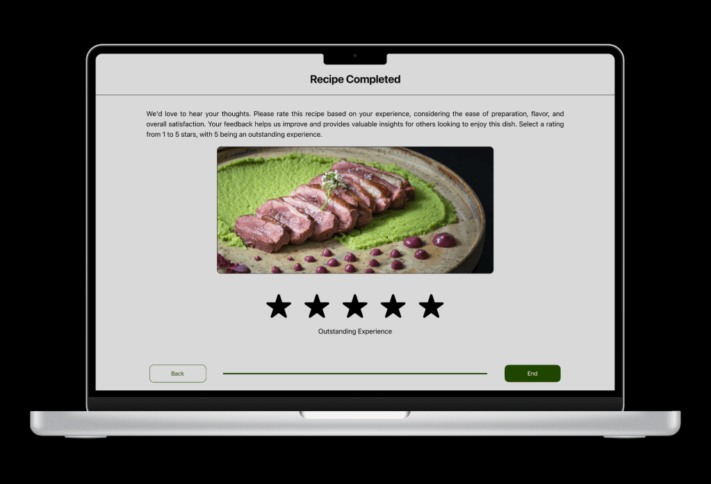
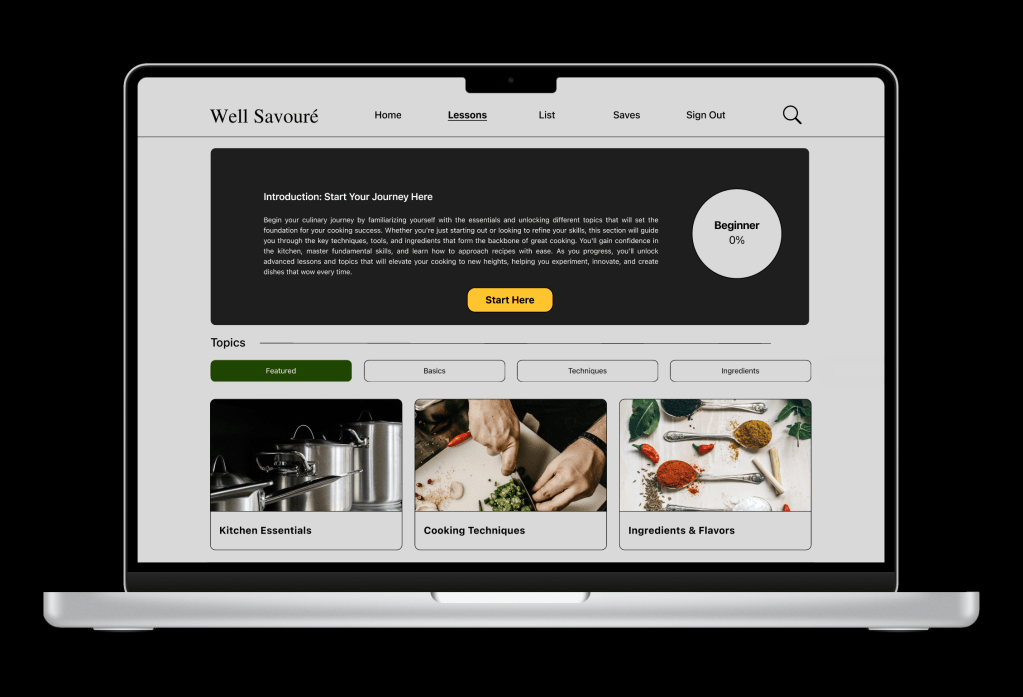
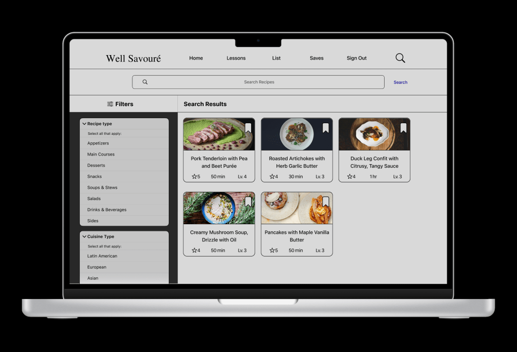
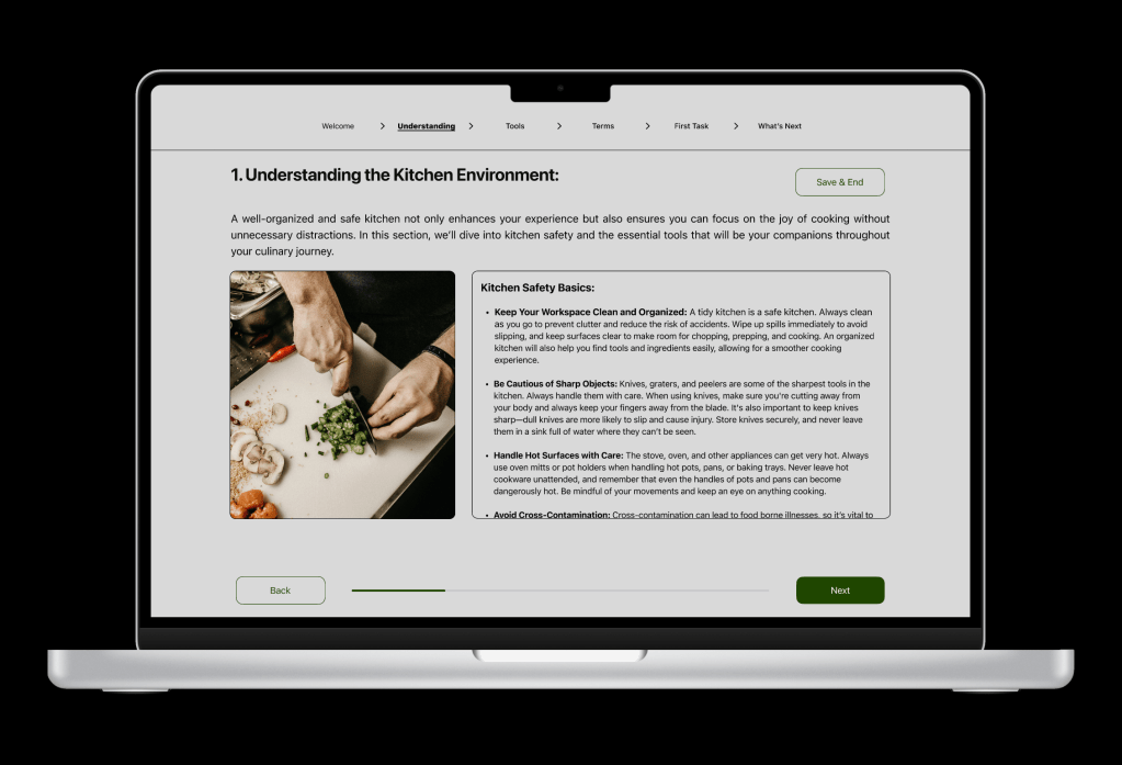
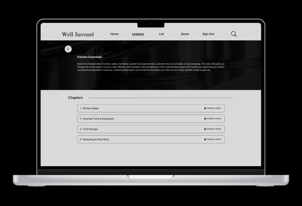
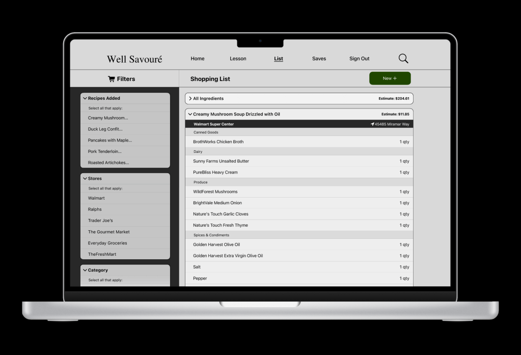
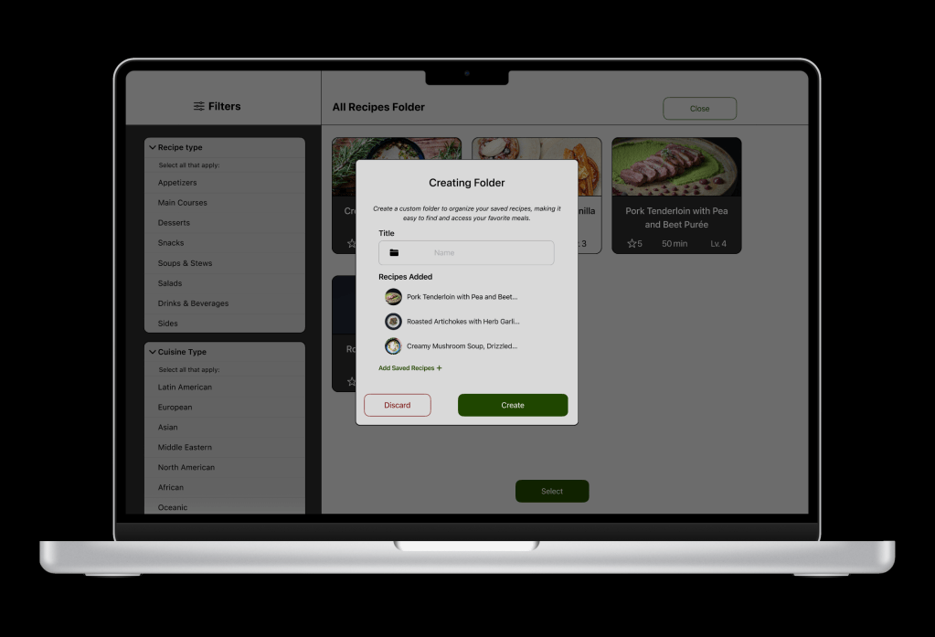
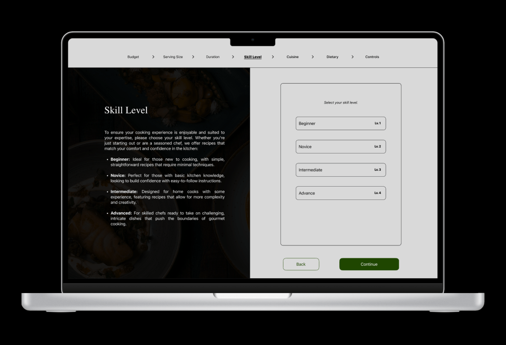
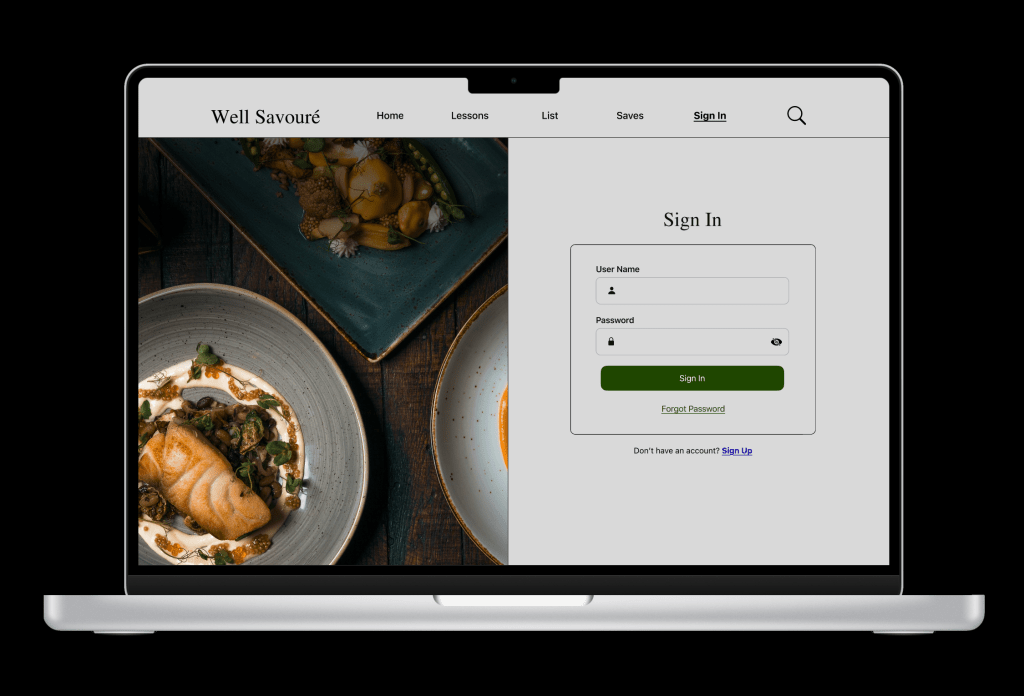
With the research and strategy collected, a color palette and typeface pairings were chosen to help set the direction of the app. A few of the wireframe sketches for each device were selected to expand and refine upon. Using Figma, the mobile was designed, and the prototype was created, as it helped establish the direction. The Apple IOS UI kit is used to help establish consistency and efficiency and a AAA contrast checker for accessibility and legibility. The desktop was next and auto layout was introduced for certain areas while making new adjustments to the layout for a wider screen, looking at how user goals differ and how the interactions would change. Finally the tablet and it was reduced to focusing on a singular feature while adjusting to a medium-sized screen.
Sprint 6-7 (4-Week Duration) – Usability Testing & Update
The mobile prototype was selected for usability testing, and setting up 5 tasks for participants to complete. The majority of the tasks were successful, but there were areas that were ineffective or challenging to navigate. Feedback from the test was organized and prioritized a few areas that needed revisions and improvement. In addition, the design was updated to meet accessibility standards.
Design Strategy
Primary Behavior, Demographic, & User Goals
Focusing on low-income Americans (18+), food enthusiasts who want to learn and improve their skills, substitute ingredients for more affordable options, and plan meals with ease. The goals are to create high-quality meals with guidance, options to substitute ingredients based on costs, build upon cooking abilities, generate a grocery list, and filter and organize recipes.
Device Rationale
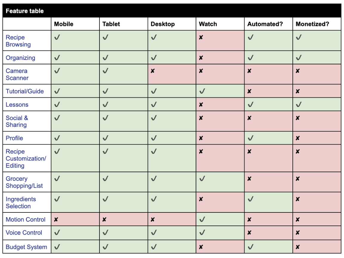
Three devices were selected: mobile, desktop, and tablet. The mobile provides convenience, easy access, notifications, easy browsing, quick meals, a shopping list, and short tutorials. Mobile screen are smaller and have limited viewing however. The tablet has a wider display and allows for a little more detailed recipes and function similarly to mobile. It can be placed in an area that doesn’t require the user to get too close when cooking. The desktop has a much larger display and great for multitasking. It can go even further in organizing, notes, lists, lessons, and extended cooking tips. It is not as practical when it comes to actively cooking. The watch was also considered but due to time constraints, the watch wasn’t designed. The content for the watch is more limited but can be used for a shopping list, very brief recipe info, notifications, a timer, and sync during times when a user is cooking with gesture and voice commands make hands-free navigation when cooking.
Ways to Automate & Monetize
Ways to automate Well Savouré are through feature recipes based on users’ preferences and budget, automatically generate a grocery list that can be edited, receive notifications regarding cooking, in-season dishes, lessons, reminders, and set timers or videos for users to follow. For monetization, there can be a subscription based on how much the user wants to learn, personalized meal planning by professionals, in-depth and advanced techniques and lessons, and deeper insights regarding the ingredients and cooking process.
Design Planning
Mobile Sketches & Wireframes
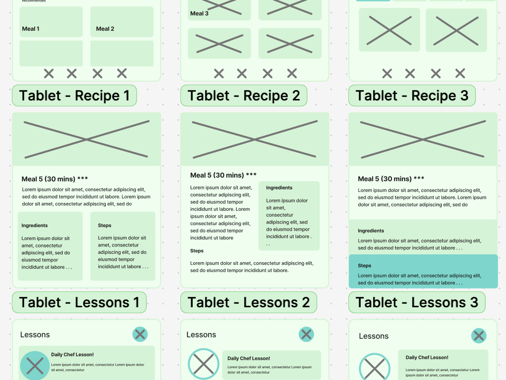
Tablet Sketches & Wireframes
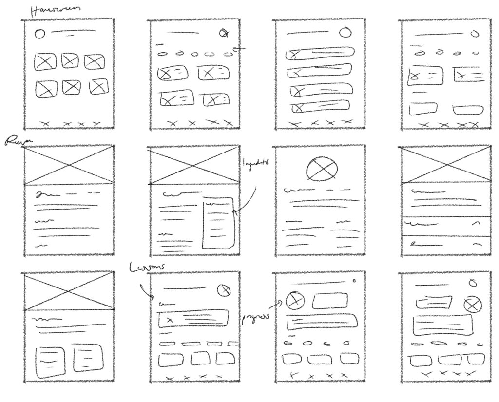
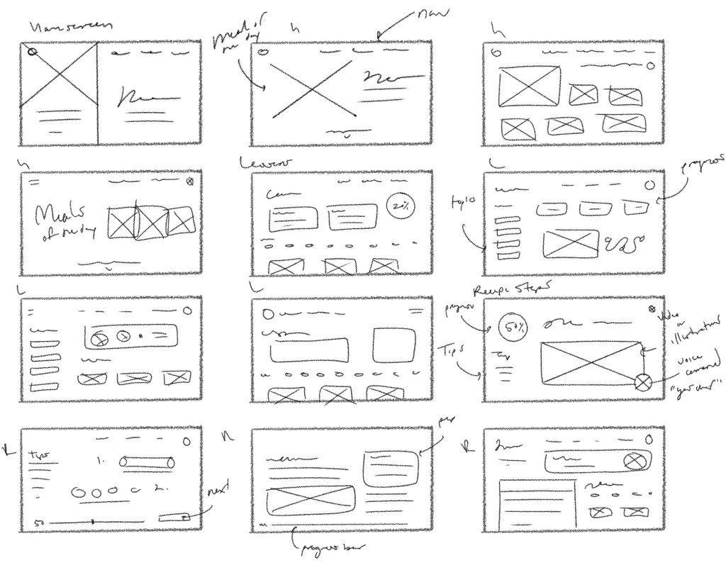
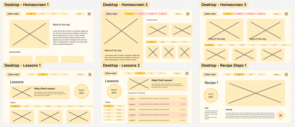
Desktop Sketches & Wireframes
Screen Designs
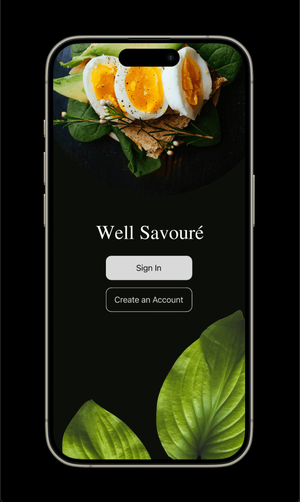
Mobile


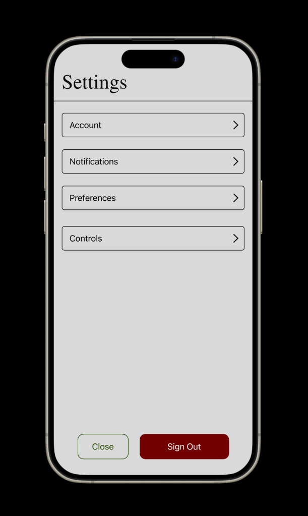
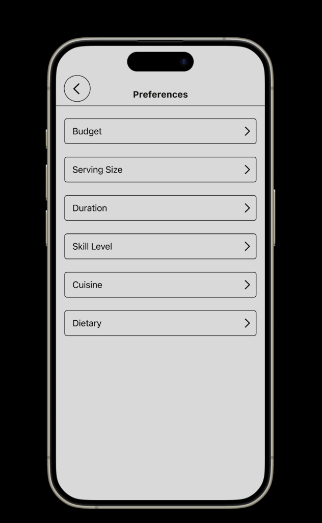
Tablet
Desktop




Usability Test
Executive summary
The test was conducted with 3 available users, college students, as the main usability goal was on the effectiveness of choosing a recipe. The main features/functions that were highlighted were generating a grocery list, filtering recipes, creating a folder to store saved recipes, navigating instructions, and capturing an image of leftover ingredients to search for recipes.
The testing showed a high completion rate, with all participants completing at least 4 out of 5 tasks assigned to them. Users were able to navigate to the interface at ease for the majority of the process as they used the navigation bar as intended, and effectively identified the icons. About 2 of 3 participants couldn’t generate a list as the process became confusing. All participants were able to search, filter, select a recipe, and follow the steps with ease. Lastly, 2 of 3 participants struggled to locate the folder feature, but all participants were able to create one once found. Verbal feedback was received with a need to stay consistent with the wording and buttons, and noting small glitches or mishaps on some screens. They also note that the interface was clean and easy to digest. From these results, it’s suggested to make the process clearer when generating a grocery list, shifting the focus of the profile to a folder section, and fixing any faulty errors or glitches that occurred. The test showed how effective is the UI for Well Savouré and pointed out the areas that need adjustments for a smoother experience.
Detailed Findings
Great Completion Rate of Tasks: Most of the functions and features were easy to locate and access. They all enjoyed the interface as they mentioned the layout and navigation. About 2 of 3 participants were able to complete 4 of the 5 tasks, while 1 of 3 participants completed all 5 tasks.
Process of Grocery List was Challenging: The first task was the only task in which 2 of 3 participants did not complete. They were able to locate the list feature, but became hesitant or confused when generating a list. One of the participants managed to generate one, however, they did not review the list to successfully complete the task.
The Difficulty of Locating the Folder Feature: Creating a folder was located in the profile section, however, 100% of participants struggled to locate it at first. When they did, they were able to complete it, but the duration of locating it took longer than anticipated, as 2 of 3 participants took around a minute to complete the task.
Glitches or Errors: There were a few errors that went unseen until testing. About 2 of 3 participants encountered glitches when tapping on certain buttons. In addition, remaining consistent with the wording, as 2 of 3 participants pointed out areas that didn’t match the function or button.
Data Analysis
Qualitative
Highlights
- All participants completed at least 4 out of 5 tasks.
- 2 of 3 participants encountered glitches or mishaps on some screens.
- All participants have noted that they enjoyed the layout and process of the prototype.
Task 1 – Generate a Grocery List
- 2 of 3 participants couldn’t generate a grocery list.
Task 2 – Search and Filter a Recipe
- All participants struggled before successfully locating and creating a folder to store saved recipes.
- 2 of 3 participants took around a minute to complete task 3 of locating and creating a folder.
Task 3 – Create a Folder to Store Recipes
- 2 of 3 participants took around a minute to complete task 3 of locating and creating a folder.
Task 4 – Navigate Through Step-by-step Instructions for a Recipe
- All participants successfully navigated with ease.
Task 5 – Capture an Image of Leftover Ingredients to Search for Recipes
- 2 of 3 participants struggled slightly to locate the camera feature to capture leftover meals.
Qualitative
Highlights
- “I really like the layout. It looks really good and the design is really clean, organized, and easy to digest.” – Adele C
- “Seems all your buttons are working. Your interface is very easy to read.” – Monica V
Task 2 – Search and Filter a Recipe
- “I noticed that the ‘egg-free’ option is gone, so I would make sure that still remains with the dietary restrictions.” – Sedona S
- Referring to seeing the option when signing up, but not in the filter section.
- “I like that you can see all ingredients and then filter by recipe, but maybe there is a way to make that more obvious, like filter by or show a list by individual ingredients or recipe. I think I’m expecting to see a list of individual products on this list because that’s what I would put on my grocery list.” – Adele C
Task 4 – Navigate Through Step-by-step Instructions for a Recipe
- “I feel a little stuck on it and have to reread it to understand. Maybe the list should say review, and start should say proceed to match the verbiage from the instructions.” – Adele C
Task 5 – Capture an Image of Leftover Ingredients to Search for Recipes
- “I like the search for leftover ingredients feature, I wonder where I could find that. Like if there is a list that can pop up here [Grocery list section] or where the [left over] food was saved.” – Sedona S
- “For that last task [capturing leftover ingredients to search for recipes], that was a little difficult because it’s in the search bar. I wouldn’t know automatically if I was searching through, but if I search for it, I would eventually figure it out. It just takes a while.” – Monica V
- “I do wish that there were a bigger option centered on an action button or at the bottom right.” – Adele C
Design Prioritization
High Priority Usability Concerns
- Make the grocery list generator a smoother experience and easier to locate. About 2 of 3 participants didn’t complete the first task as intended. Participant 1 was able to find the list section and locate the add button, but didn’t pursue it further. Participant 2 was able to find the grocery list section but started to struggle. They eventually generated one, but weren’t able to view the list as the instructions didn’t correlate with the buttons very well.
- Rather than a profile section, shift the focus to a folder section. All participants struggled to locate the folder feature to create and store saved recipes. They tend to browse through different features before they can locate it. About 2 of 3 participants took around 1 minute to complete.
High Priority Accessibility Concerns
Throughout the app, a lot of the elements have met accessibility standards such as legible text size, legible typefaces, placement of labels for inputs, consistent layout, and sufficient spacing. Nevertheless, there are a few areas that need to be reviewed and updated.
- Buttons & Tap Targets – Increase Button Size and High Contrast Colors.
- Images and icons – Adding alt text descriptions, avoiding text inside images, and using recognizable icons.
Walkthrough
Prototypes & Flowchart
Mobile
Tablet
Desktop
Flowchart
Sources & Citations
Sources
Videos
- Microsoft’s Satya Nadella on Inclusive Design: https://youtu.be/iNa58td79ok?si=hdSy3RARe9BLo1FT
- Design for Seven Billion; Design for One: https://youtu.be/vPH1exUrSh8?si=js44jouK_Nl7TZEh
- Kate Holmes Rethink What Inclusive Design Means: https://youtu.be/-iccWRhKZa8?si=tymmpJoAFI0s3OFv
- TEDxHogeschooolUtrecht – Sebastian Deterding: https://youtu.be/PYQ4V-Oc0ao?si=fJzRIM25RlHGDRGD
- Responsve Web Design: https://youtu.be/zF6VSky4SIc?si=z7yWsJCSUZXXvY2-
- Responisve Design by Amara Hulslander: https://www.youtube.com/watch?v=i7yo0780Kis&list=PLQPgGl2dZh5LjDn-0smzTwV3EhBD7AKWZ&ab_channel=AmaraHulslander
- Auto Layout: https://www.youtube.com/playlist?list=PLXDU_eVOJTx55HFubfbTL3ellJjBM2QE2
- 2nd Pillar of Usability Testing: https://youtu.be/dkKS6aKEC6M
- Accessibility UX Insights: https://youtu.be/38fbB8wCPzg
- Accessible Web Design: https://youtu.be/-ao_Kc_8rpE?si=T6gWoDZYBZquzaJo
- Apple IOS UI Kit: https://www.figma.com/community/file/1385659531316001292
Readings
- Microsoft Inclusive Design: https://inclusive.microsoft.design/
- The Field Guide to UX Startegy: https://s3.amazonaws.com/uxpin/uxpin_the_field_guide_to_ux_strategy.pdf
- Apple Interface Guidlines: https://developer.apple.com/design/human-interface-guidelines
- Flowcharts in UX/UI Design: https://www.interaction-design.org/literature/topics/flowcharts
- Greever, T. (2015). Articulating design decisions : Communicate with stakeholders, keep your sanity, and deliver the best user experience. O’Reilly Media, Incorporated.
- Adam Connor, & Aaron Irizarry. (2015). Discussing Design : Improving Communication and Collaboration Through Critique. O’Reilly Media.
- 7 Things Every Designer Needs to Know about Accessibility: https://medium.com/salesforce-ux/7-things-every-designer-needs-to-know-about-accessibility-64f105f0881b
- Designing for Accessibility is Not that Hard: https://uxdesign.cc/designing-for-accessibility-is-not-that-hard-c04cc4779d94
Imagery & Extras
- https://www.pexels.com/
- https://unsplash.com/
- Contrast Checker: https://www.audioeye.com/color-contrast-checker/
Citations
- Myers, Jonathan, Matthew P. Harber, Lackeisha Johnson, Ross Arena, and Leonard A, Kaminsky. “Current State of Unhealthy Living Characteristics in White, African American and Latinx Populations.” Progress in Cardiovascular Diseases 71, (2022): 20-26. doi: https://doi.org/10.1016/j.pcad.2022.05.002
- Okrent, Abigail., Bing-Hwan Lin, Joanne Guthrie, and Richard Volpe. “Americans’ Food Choices at Home and Away: How Do They Compare With Recommendations?” USDA, Amber Waves, February 21, 2023. https://www.ers.usda.gov/amber-waves/2013/february/americans-food-choices-at-home-and-away#:~:text=Though%20the%20Dietary%20Guidelines%20have,much%20saturated%20fat%20and%20sodium.
- Ritchie, Hannah and Pablo Rosado. “Three Billion People Cannot Afford a Healthy Diet.” Our World in Data, Last updated in September 2024. https://ourworldindata.org/diet-affordability
- “Supplemental Nutrition Assistance Program: Estimated Eligibility and Receipt Among Food Insecure College Students.” GAO, June 24, 2024. https://www.gao.gov/products/gao-24-107074#:~:text=Fast%20Facts,didn’t%20report%20receiving%20benefits